Assignment 05
Alphabet: Week Ⅰ - Letterforms
Choose one of the two methods below to create a new alphabet. 100% black & white only.
Method 1: Material Transformation
Using an existing typeface as your skeleton, create a new version of this typeface with a commonly found tool, object or material (spray foam, pasta, tape, q-tips, etc). Consider how texture, irregularity, and physical constraints create new variations in the type.
Method 2: Modular System
Using a modular system, create a typeface that emphasize consistency, repetition, and logic. A modular system does not need to be a grid, it can be a set of paramaters set forth by the designer (objects the size of a hand, cracks in the sidewalk, letters on a street, etc).
Due This Week
Next class, choose a method and create 5 letters (see below). Print all 5 letters on their own 8.5×11" sheets of paper. Be prepared to explain how your method informed the design of your letterforms.
Letters
1. A (a)
2. E (e)
3. T (t)
4. O (o)
5. M (m)
Further Explanation
Our goal for this assignment is to create experimental typography. Our priority is form over function. When designing a typeface, a type designer typically considers the function of the form they are drawing. A typeface is meant to be read, and legibility is equally important to form. We are not concerned with legibility in this assignment. The letterform is your content, it is a base at which you can begin your design. From there, you are free to explore its formal qualities. Ultimately, as Matthew Carter expressed “Type is a beautiful group of letters, not a group of beautiful letters”. This means, as you develop all of your letters from A-Z, there must be a stylistic or systematic trait that ties all of your forms together. But apart from that, you are free to push the boundaries of typography.
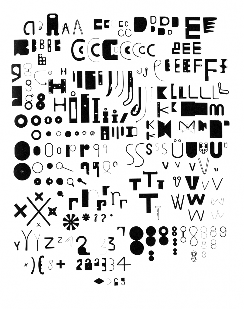 Found Font, Paul Elliman, 1992
Background
“Found Font, also known as ‘Bits’ was developed by Paul Elliman in the 90’s and was published in Fuse. The aim of the project was to create a typeface where no character form is used more than once, which requires an infinite amount of characters. Found Font began as a collection of found human made items that were often thrown away, broken or worn out, which he started collecting while he was travelling in 1989. By using human made items to form a typeface, it shows the connection between construction of the environment and construction of language. There was a criteria to the size of the found items: each piece must be small enough to fit in the mouth, or to be passed from hand to hand like money. This made sure all of the shapes were nicely sized.”
Analysis by Chloe Wooldrage.
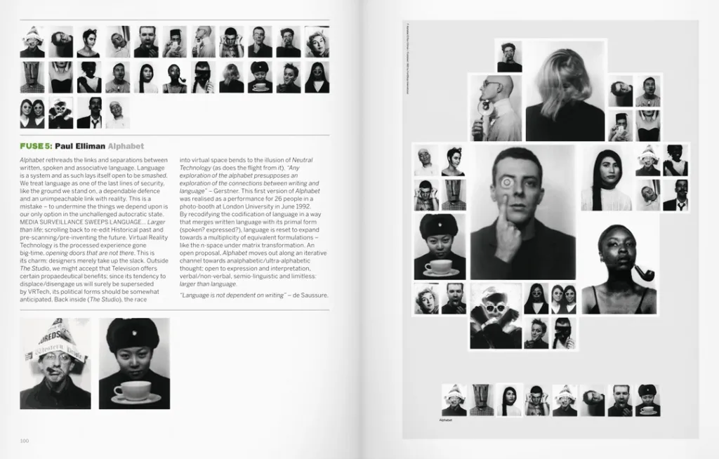 Alphabet, Paul Elliman, 1992
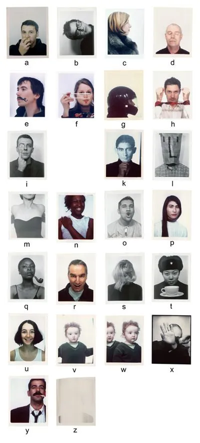 Alphabet, Paul Elliman, 1992 breakdown by Chloe Wooldrage
 Spray Foam Times New Roman by Maya Berenblum
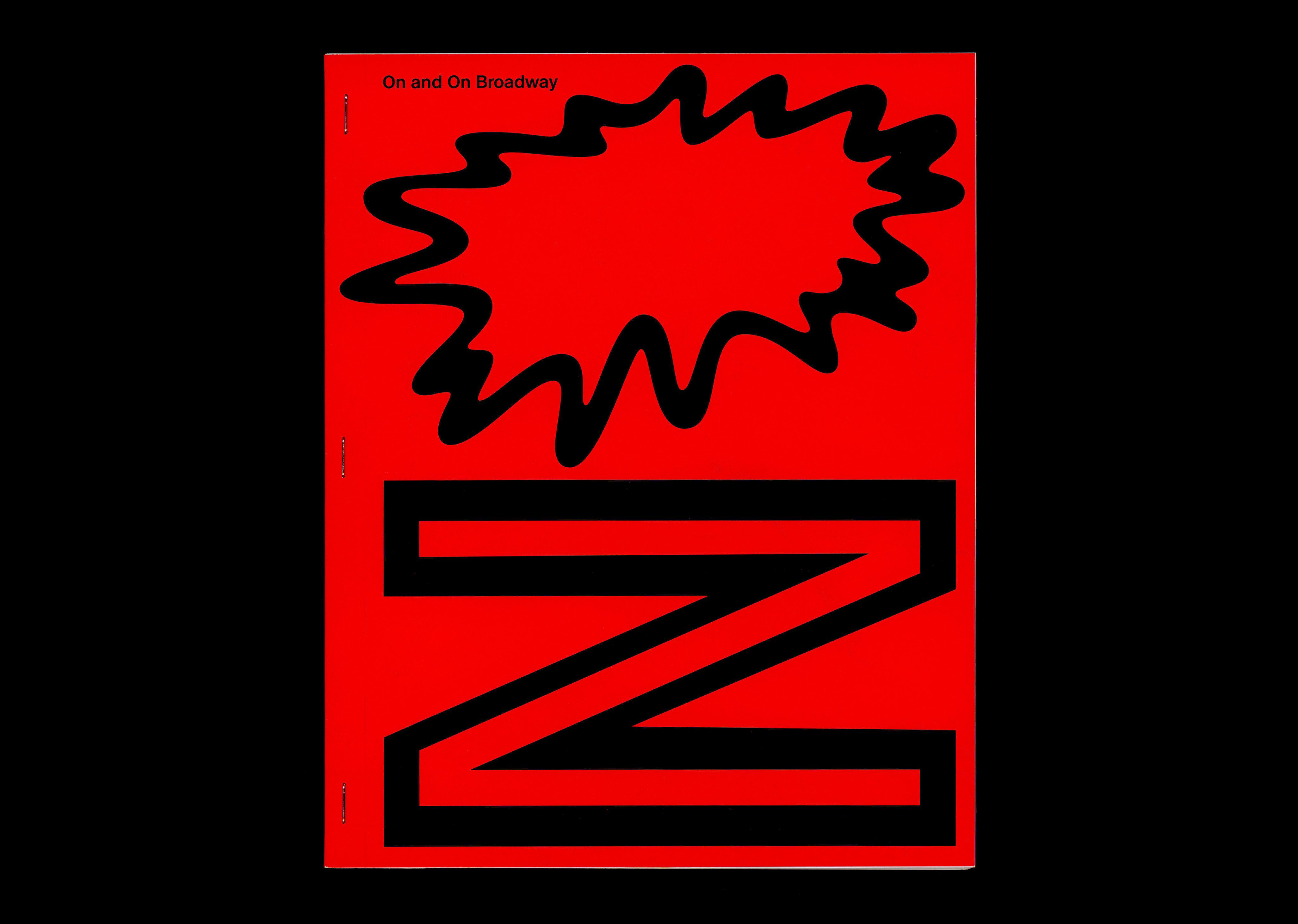 Other Means & ECAL On and On Broadway - Cover
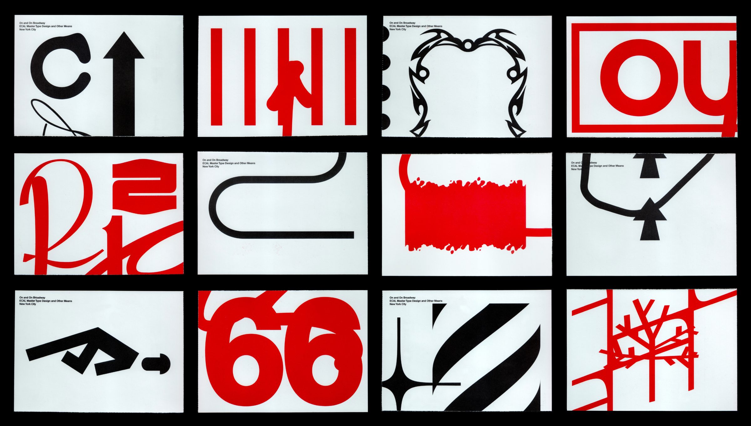 Other Means & ECAL On and On Broadway - Cards
Background
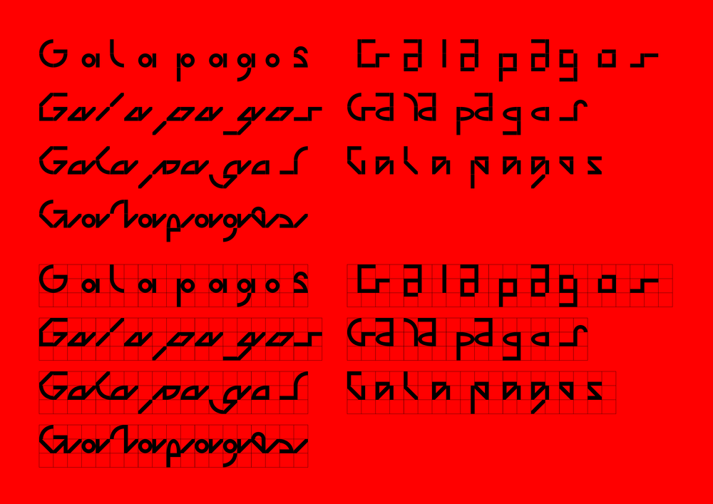
Type design is, in part, about modular design: If you’ve made a decision in a capital E, for example, your design decision should be reflected in your capital B. These specific parameters from your B will be used in your capital P and R. The round elements in your P and R will inform how you draw your S. The curves in the S will define your round characters like O and C. As you can see, your logic and system, if well defined, will help you design the rest of the letters.
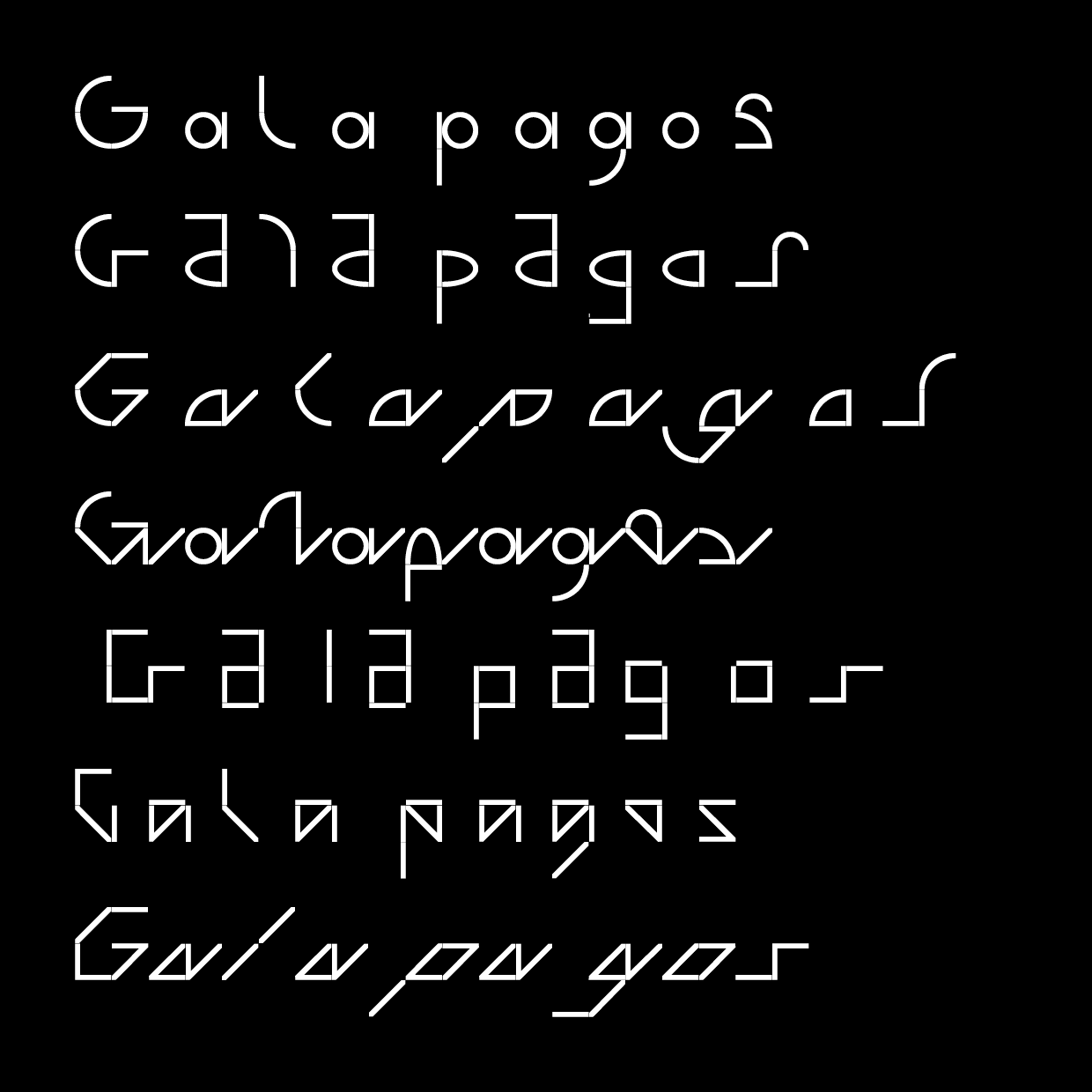
1. Galapagos by Felix Salut & Dinamo
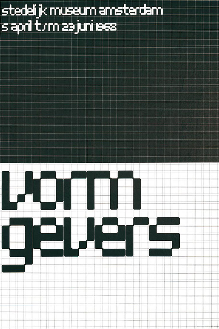
2. Stedelijk Museum Amsterdam Poster 1968 by Wim Crouwel
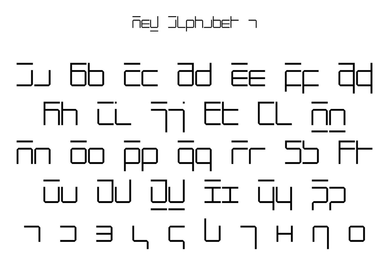
3. Neu Alphabet by Wim Crouwel
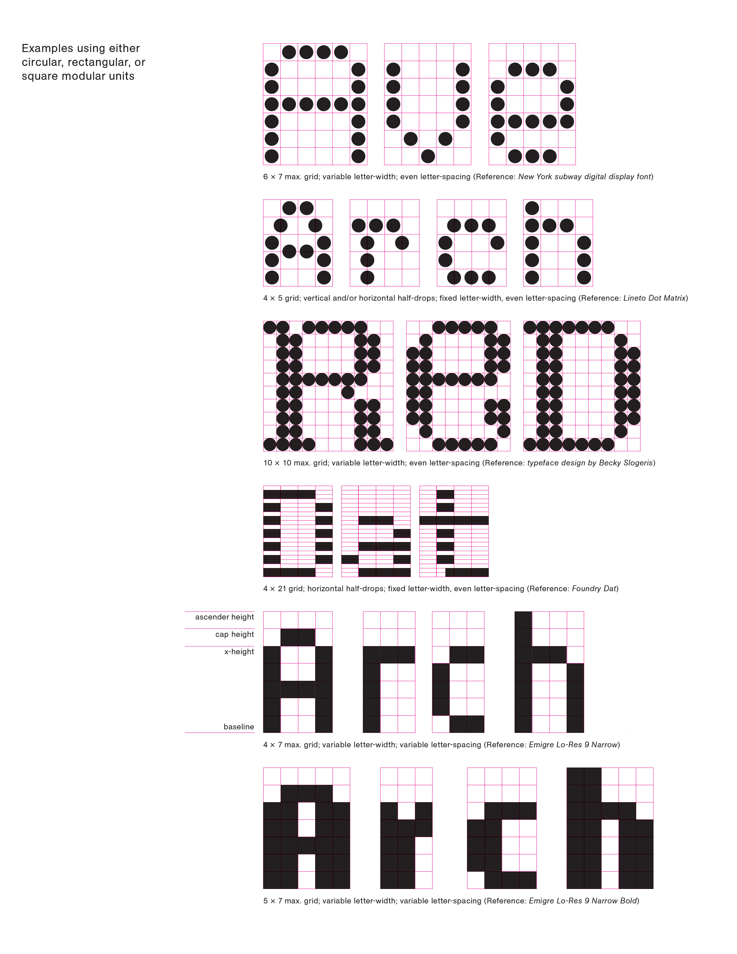
4. Examples of underlying grids cureated by Julien Bittner