Assignment 06
Collective Essay: Week Ⅰ - Paragraph
You will be assigned a reading. Use the content of your reading to typeset the text across 8, 12 or 16 5.5×8.5in pages. Your goal is to reflect the content and purpose of the essay through design and layout choices while settting legible, beautiful text. One color only.
Define your page’s margins and design a running header and folio system. Your first page should be a title page, including the name of your essay and your author. On the final page, credit yourself and include the typeface you’ve chosen to typeset your essay. Consider reviewing our lecture from class.
Next class print your pages as spreads, single sided and hang your work. We will crit as a group. Then we will conduct desk crits, please bring your laptop so you can work on your text setting in class through one on one instruction.
Revisit todays class lecture on Page Construction.
Essays
01. The Crystal Goblet by Beatrice Warde
02. The Principles of the New Typography by Jan Tschichold
03. Continuity And Change by Max Bill
04. The Shape of Words by Bruno Munari
05. Typography as Discourse by Katherine McCoy with David Frej
06. We're Here to Be Bad by Tibor Kalman and Karrie Jacobs
07. Neomania by Anne Burdick
08. No more heroes by Bridget Wilkins
09. Cult of the Ugly by Stephen Heller
10. More Light! by Robin Kinross
11. First Things First by Ken Garland
12. The Particular Problem with Graphic Design History by Andrew Blauvelt
13. Under the surface of style by Andrew Blauvelt
14. Style is not a Four Letter Word by Mr. Keedy
15. What is This Thing Called Graphic Design Criticism? by Michael Rock and Rick Poynor
16. Designer as Author by Michael Rock
17. Fuck Content by Michael Rock
18. Research & Destroy by Daniel Van Der Velden
19. Ronald McDonald Ollie Dos & Don’ts: What Mascots Can Teach Us About Branding by Other Means
20. Do you Want Typography or do You Want the Truth? By Erik Carter
Learning Outcomes
Typographic Proficiency: Demonstrate the ability to select an appropriate typeface and apply typography principles for legible and visually appealing text. Layout Design Skills: Define page margins and create a consistent running header and folio system that complements the content. Visual Communication: Effectively communicate the content and purpose of the essay through design and layout choices. Attention to Detail: Pay close attention to design details such as spacing, kerning, and consistency to create a cohesive and well set document.
Background
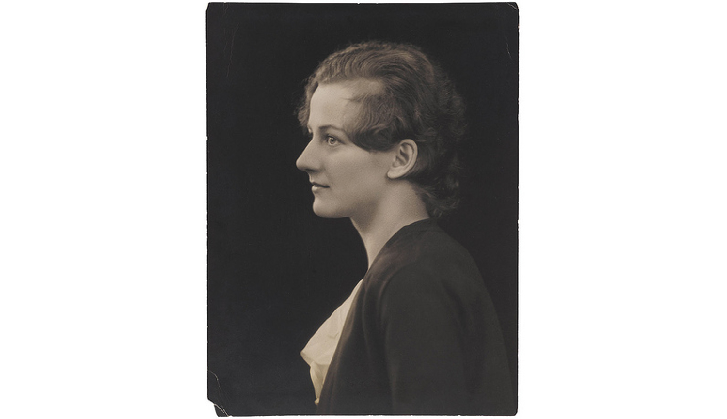
Beatrice Lamberton Warde (September 20, 1900 – September 16, 1969) was a twentieth century writer and scholar of typography. As a marketing manager for the British Monotype Corporation, she was influential in the development of printing tastes in Britain and elsewhere in the mid-twentieth century and was recognized at the time as “one of the few women typographers in the world”. Her writing advocated higher standards in printing, and championed intelligent use of historic typefaces from the past, which Monotype specialised in reviving, and the work of contemporary typeface designers.
“The Crystal Goblet” (1932) is rich with metaphors. The title itself is a reference to a clear vessel holding wine, where the vessel, the printed word, gives no obstruction to the presentation of its content, the text. Warde poses a choice between two wine glasses: one of “solid gold, wrought in the most exquisite patterns” and one of “crystal-clear glass.”
Now the man who first chose glass instead of clay or metal to hold his wine was a “modernist” in the sense in which I am going to use that term. That is, the first he asked of this particular object was not “How should it look?” but “What must it do?” and to that extent all good typography is modernist.
Throughout the essay, Warde argues for the discipline and humility required to create quietly set, “transparent” book pages. Source