Assignment 05
Alphabet: Week Ⅰ - Letterforms
Create or assemble an alphabet using commonly found tools, letters, objects or materials.
Next class design 3 potential latin alphabets, 5 letters for each (see below). Print all 15 letters on their own 8.5×11" sheet of paper. These 3 alphabets should be totally different from one another structurally and stylistically. 100% black & white only. This week we care most about the system you are developing and the formal qualities of your letterforms.
Letters
3 alphabets × 5 letters = 15 8.5×11" prints
1. A (a)
2. E (e)
3. T (t)
4. O (o)
5. M (m)
Learning Outcomes
Visual Awareness: Heighten your visual awareness through object selection & observation. Creative Observation: Recognize artistic potential in everyday objects & materials. Visual Storytelling: Convey meaning through diverse, assembled elements in design. Letterform Design: Introduction to the fundamentals of letterform anatomy.
Background
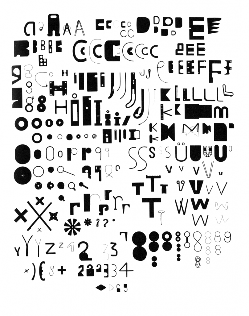
“Found Font, also known as ‘Bits’ was developed by Paul Elliman in the 90’s and was published in Fuse. The aim of the project was to create a typeface where no character form is used more than once, which requires an infinite amount of characters. Found Font began as a collection of found human made items that were often thrown away, broken or worn out, which he started collecting while he was travelling in 1989. By using human made items to form a typeface, it shows the connection between construction of the environment and construction of language. There was a criteria to the size of the found items: each piece must be small enough to fit in the mouth, or to be passed from hand to hand like money. This made sure all of the shapes were nicely sized.”
Analysis by Chloe Wooldrage.
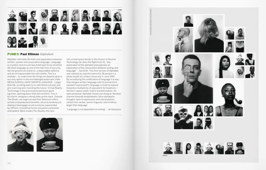 Alphabet, Paul Elliman, 1992
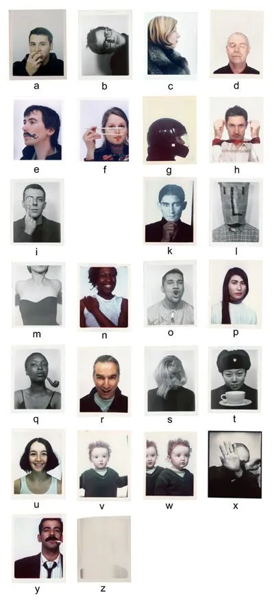 Alphabet, Paul Elliman, 1992 breakdown by Chloe Wooldrage
 Spray Foam Times New Roman by Maya Berenblum
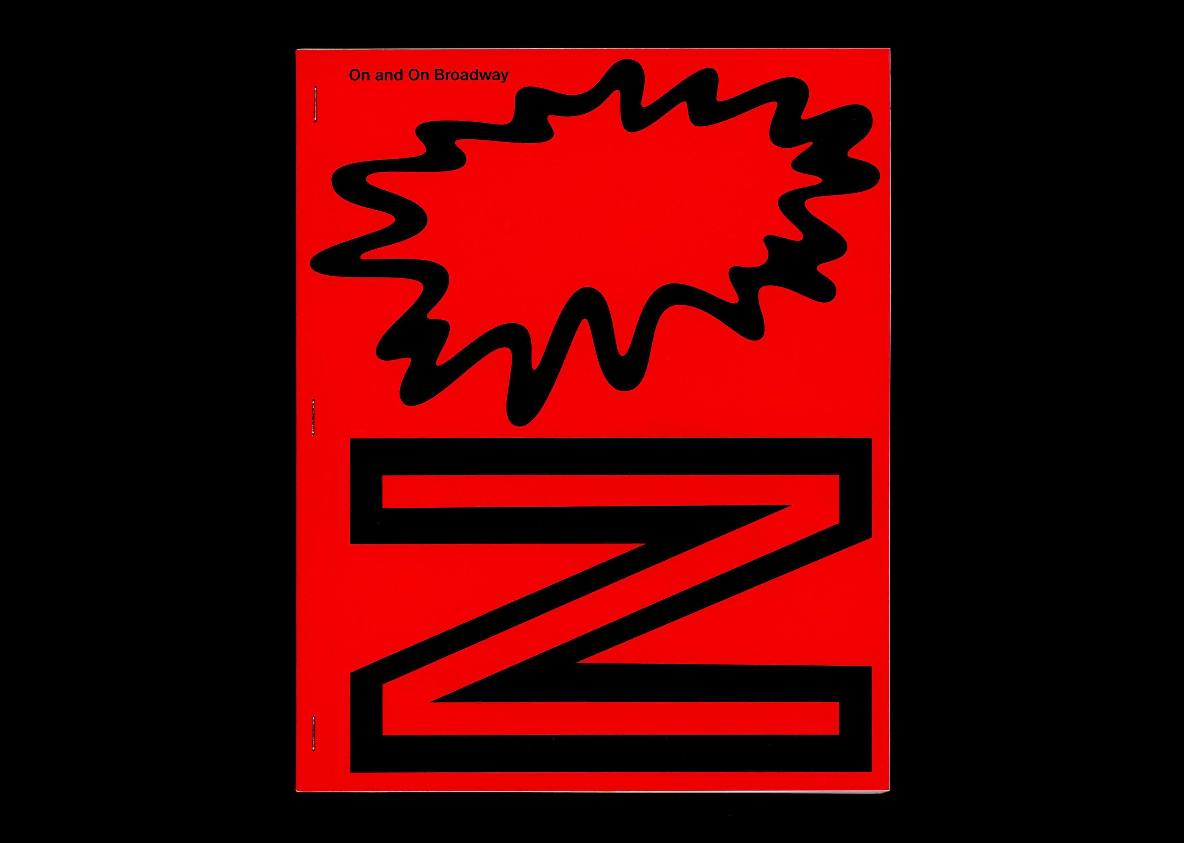 Other Means & ECAL On and On Broadway - Cover
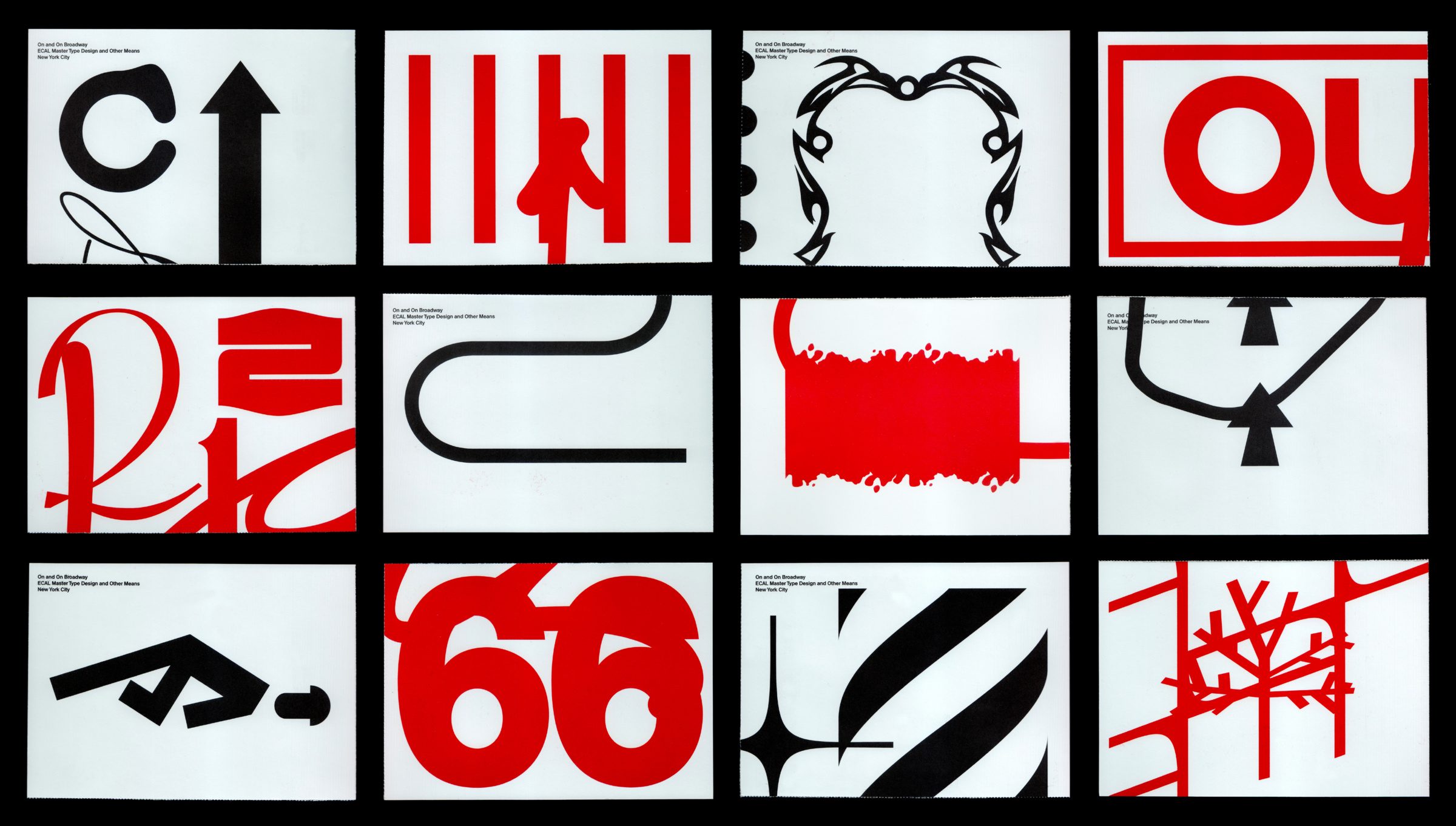 Other Means & ECAL On and On Broadway - Cards
Background
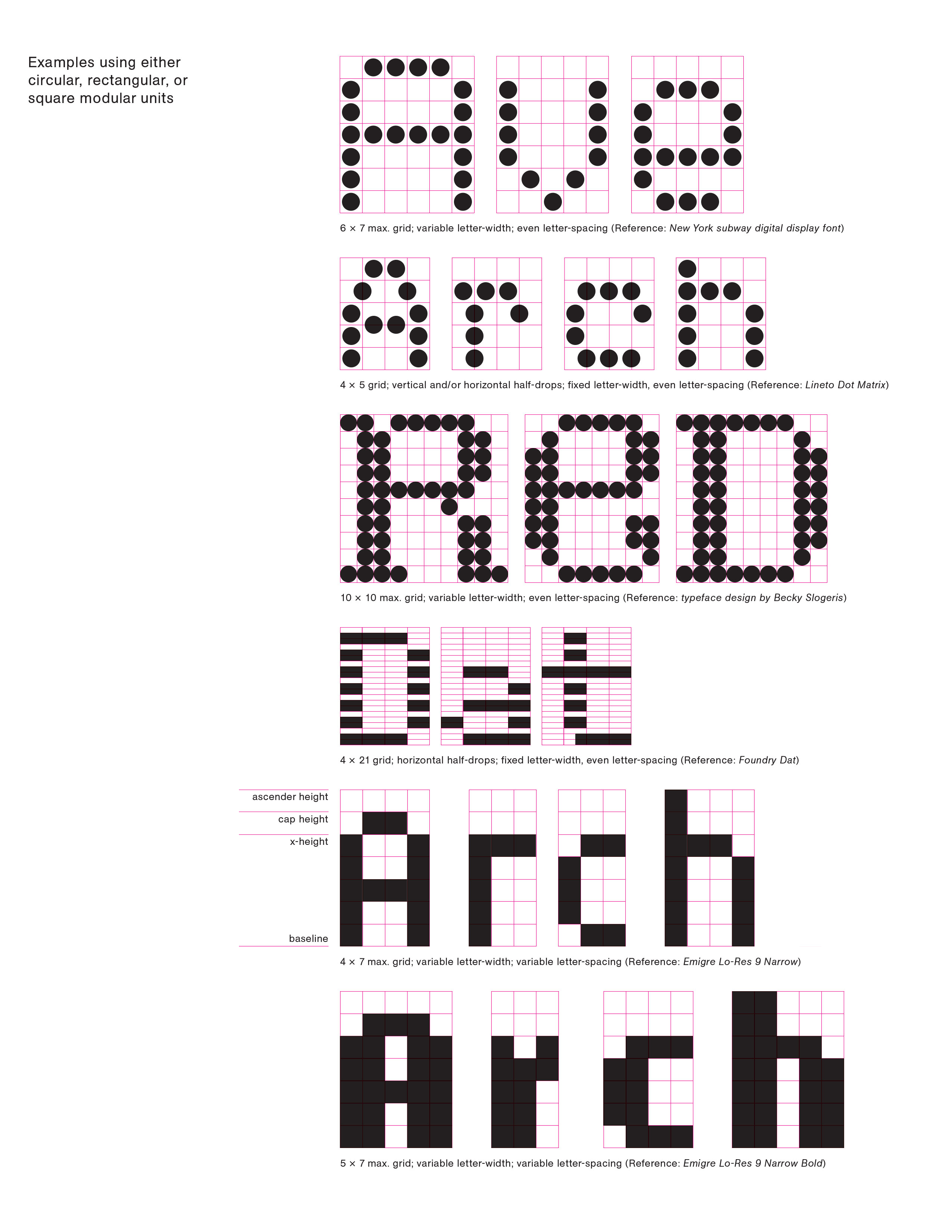
Type design is, in part, about modular design: If you’ve made a decision in a capital E, for example, your design decision should be reflected in your capital B. These specific parameters from your B will be used in your capital P and R. The round elements in your P and R will inform how you draw your S. The curves in the S will define your round characters like O and C. As you can see, your logic and system, if well defined, will help you design the rest of the letters.
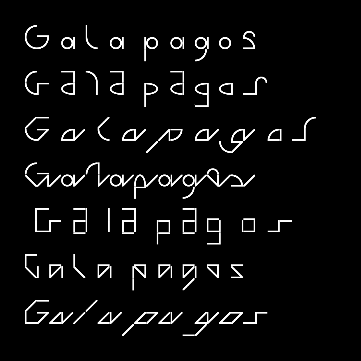
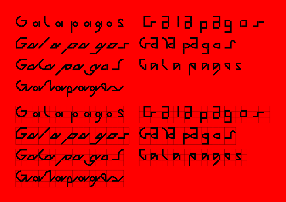
1. Galapagos by Felix Salut & Dinamo
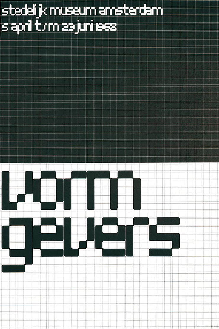
2. Stedelijk Museum Amsterdam Poster 1968 by Wim Crouwel
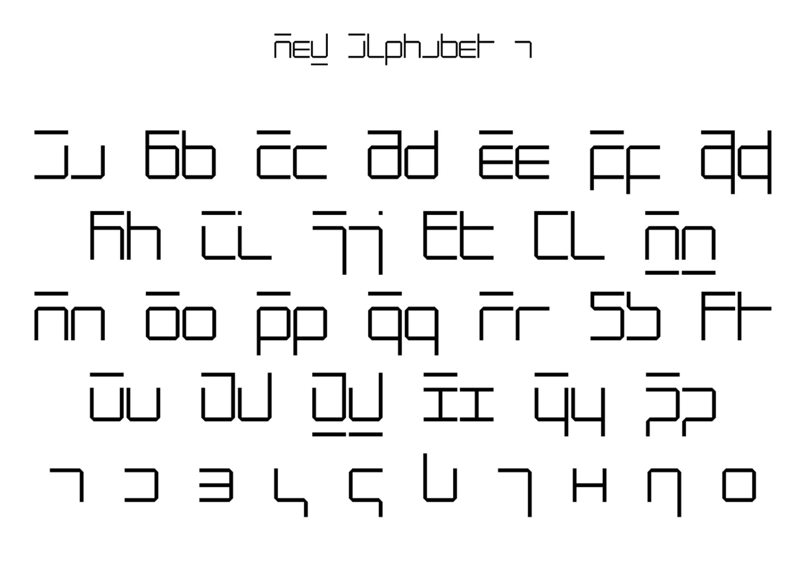
3. Neu Alphabet by Wim Crouwel
4. Examples of underlying grids cureated by Julien Bittner