Assignment 02
Typographic Heirarchy
Typography is a core skill of the graphic designer. Our workshop will introduce you to the basic termonology of type setting. Create typographic compositions using the provided type specimens. Organize the given typographic information in such a way that it is logical, legible and acessaible. Consider the information you are presenting and determine the appropriate visual hierarchy of the information. Then make a series of typographic compositions that explore and express these hierarchies in a multitude of ways, applying the principles of abstract composition explored in your previous assignments. Please print 6 copies of the specimen PDF on 8.5x11" paper for yourself to use during class.
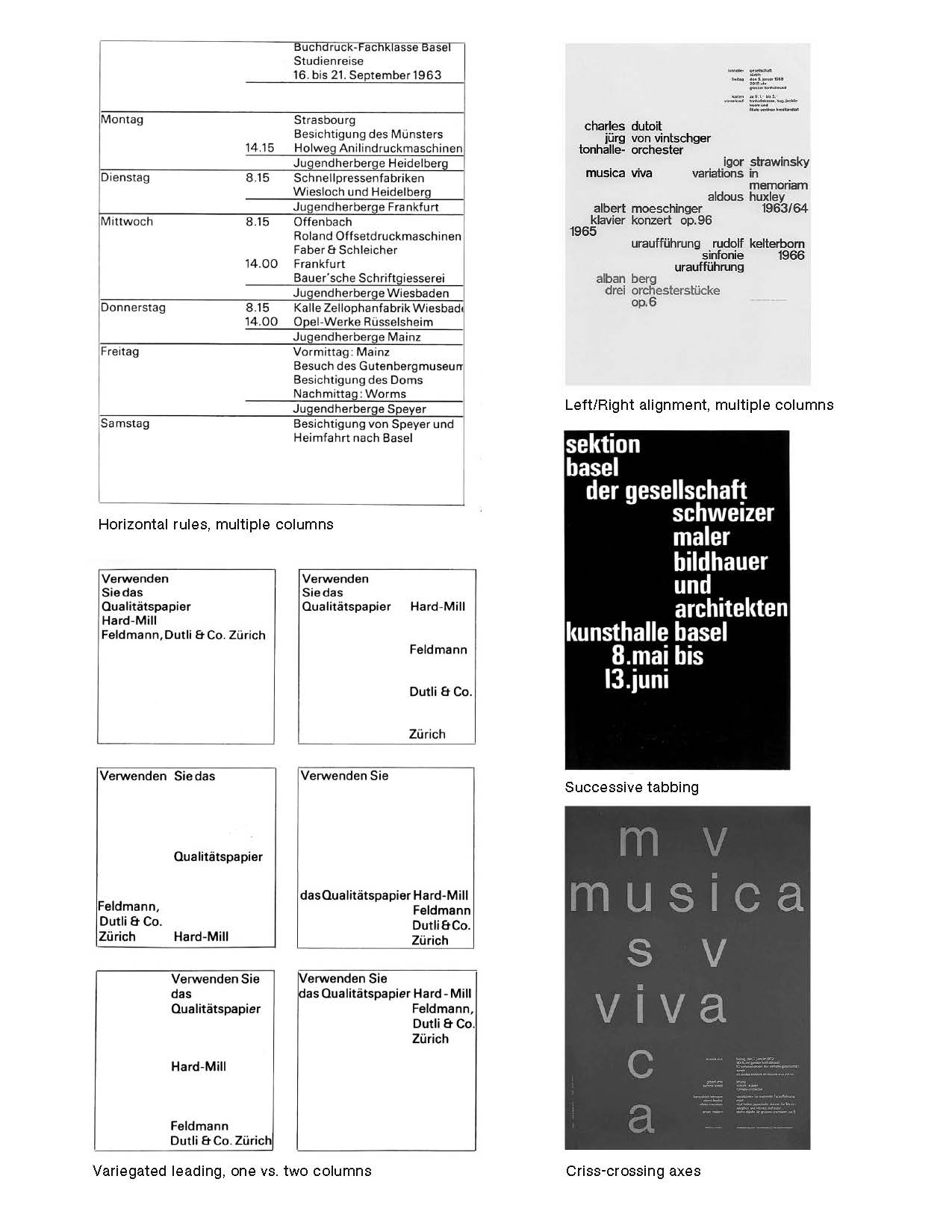
You may break up lines into individual words, or even letters, and place them anywhere on the grid, and place them vertically or horiztonally. Consider the typesetting principles we have at our disposal, including:
Typesetting Prinicples
— leading (vertical letter spacing)
— tracking (horizontal letter spacing)
— paragraph alignment (left, right, centered, justified)
— indents/hanging indents (tabbing)
— columns (single, multiple)
— symmetrical or asymmetrical page composition
— edges (including cropping)
Materials
Glue stick
Pen or Pencil
X–acto knife or cutting tool
Cork–backed ruler
Self healing cutting mat
Type specimens (6 copies, 8.5x11")
Instructions
Lecture on typesetting, 10 minutes.
Round 1, 40 Minutes: Make 2 typographic compositions. Choose one “theme” and one “typographic restriction” from the list below for each of your compositions. Stick to one theme for your composition, employ that theme thoroughly. You can only use a “theme” or “typographic restriction” once (for example, only one of your compositions can use “Columns” and “one type size, one weight”).
Hang work, 5 minutes. Crit, 15 minutes.
Round 2, 30 Minutes: Create a final composition following the same rules; choose one theme and typographic restriction for your composition. Consider “refining” or building on one of your compositions from last round, if it was successful.
Hang work, 5 minutes. Crit, 30 minutes.
Themes
— Columns
— Tabbing
— Alignment (left, center, right aligned)
rules can be used in one of your 3 compositions
Typographic Restrictions
Any one type size in any one weight
(e.g. 26 pt Medium)
Any two type sizes in the same weight
(e.g. 14 & 19 pt Bold)
Any two type sizes each in a different weight
(e.g. 26 pt Regular & 14 pt Bold)
Learning Outcomes
1. Understanding basic typographic terminology
2. Introduction to heirarchy and organizing content
3. Ability to follow restrictions
4. Repetition through craft
Background
The passage above is a scan of “Typographie: A Manual of Design” by Emil Ruder. Read the rest of this chapter on theme & variation.
Emil Ruder was a typographer and graphic designer who, born in Switzerland in 1914, helped Armin Hofmann form the Basel School of Design and establish the style of design known as Swiss Design. He taught that, above all, typography’s purpose was to communicate ideas through writing. He placed a heavy importance on sans-serif typefaces and his work is both clear and concise, especially his typography.
Like most designers classified as part of the Swiss Design movement he favored asymmetrical compositions, placing a high importance on the counters of characters and the negative space of compositions. A friend and associate of Hofmann, Frutiger and Müller Brockmann, Ruder played a key role in the development of Graphic Design Ⅰn the 1940s and 50s. His style has been emulated by many designers, and his use of grids in design has influenced the development of web design on many levels. Source.
This has been adapted from an assignment given by Julien Bittner at Yale University. Thank you.