Assignment 07
Visual Music: Week Ⅰ - Design
Design a 7" for your favorite two songs by a single artist. Use the Illustrator template as a starting point. You can only use two colors in your design. You must include the song titles and artist name on at least one side. Consider all of the surfaces of a record: a front & back cover, sleeve, and labels for “A” and “B” side.
Next class print your pages to scale and cut your covers to size. Hang your work for review.
Learning Outcomes
Implement Limited Color Palette: Make strategic decisions in selecting and applying a limited color palette consisting of only two colors, showcasing an understanding of color theory and the impact of color choices on visual communication. Consider Surface Variations: Analyze and accommodate the different surfaces of the 7" record, ensuring a harmonious design that is adapted to each surface. Demonstrate Conceptual Thinking: Develop a conceptual approach to the design, conveying the essence of the two selected songs through visual elements and composition, fostering a deeper connection between the graphic design and the music it represents. Consider Typography: Apply typographic principles to effectively communicate information such as song titles, artist name, and any additional text, ensuring legibility and alignment with the overall design concept. Create a Print-Ready Design: Generate a print-ready design file that adheres to industry standards and guidelines, considering factors such as resolution, bleed, and trim marks to ensure the successful production of the final 7" record.
Background
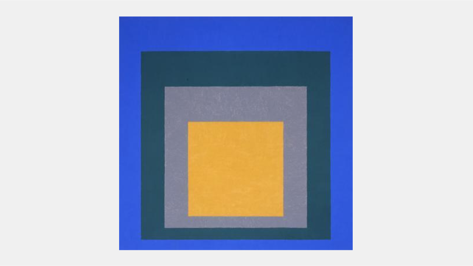
In 1963 Josef Albers published his Interaction of Color, representing one of the few serious analytical attempts by a twentieth-century artist to revise and extend existing color theory. As stated in the publication’s introduction, it represents the artist’s articulation of “an experimental way of studying and of teaching color,” placing experiential practice before academic theory. Albers continues: “In visual perception a color is almost never seen as it really is—as it physically is. This fact makes color the most relative medium in art. In order to use color effectively it is necessary to recognize that color deceives continually.”2 The essential instability of color, which Albers described as “the discrepancy between the physical fact and the psychological effect” of a work of art, was repeatedly manifested in his seminal series Homage to the Square (1950–76). This series of abstract paintings and prints has often been seen as the culmination of Albers’s experimentation with color and light, a central focus throughout his career as an artist and teacher. In works such as Homage to the Square: Aurora and throughout the series, Albers negotiated the opposition between the physical materiality and subjective phenomena of color.
Albers painted more than one thousand Homage to the Square works during the last twenty-six years of his life, and many more were produced as lithographs and screen prints. Albers often used oil paint straight from the manufacturer’s tube, precisely applying thin coats with a palette knife to the rough side of a Masonite panel. He carefully recorded the technical details of each painting on the back of the panel, including the dimensions, the names of the paints used, and any varnishes or other materials applied to the surface of the painting. Through the self-imposed restriction of the square and his methodical articulation of color, Albers’s work moves against acknowledging the personal, expressive hand of the artist.
Michael Murawski
Director of Education and Public Programs, Portland Art Museum, Oregon
Source
1. Josef Albers, Homage to the Square: Aurora, 1951–55