Assignment 08
Grids & Structure: Grid
Design a 5.5×8.5" type specimen zine for one of Massimo Vignelli’s Favorite typefaces. Your specimen design and layout should highlight the unique features of your chosen typeface. It should also exemplify how your typeface could be used in context.
1. Garamond
2. Bodoni
3. Futura
4. Times New Roman
5. Helvetica
6. Univers
Complete the interior spreads of your zine, 12 pages minimum. Next week, we will discuss your design system: grids, margins, and layout decisions. Print your zine single sided and hang your work in order. In addition to all the spreads in your zine, print a spread with your structure exposed; annotate your grid columns, rows and page margins.
Requirements
—12 pages minimum
—Character Set, upper and lowercase with punctuation and numerals
—Example ‘waterfall’ text setting, from 10pt to 70pt in 10pt increments
—Three spreads highlighting unique characteristics of your typeface, one characteristic per spread
—Minimum 5 page history describing the story of your typeface using text and historical images
—Annotated spread with grids and margin exposed
Learning Outcomes
Grid Systems and Layout: Through the design of the zine's interior spreads, students will master the application of grid systems, margins, and layout decisions to organize content effectively. Typeface Exploration: Students will highlight the unique features of their chosen typeface through intentional design decisions within the zine. By creating three spreads that focus on specific characteristics of the typeface, students will develop the ability to communicate the distinct qualities of typography in a visual medium. Historical Context and Narrative Design: Students will develop a comprehensive historical understanding of their chosen typeface. Through our critique, they will understand the history of the other typefaces featured in this assignment. Critical Analysis and Reflection: Students will engage in critical analysis of their design choices through the process of annotating grids and margins. Through reflection on their design systems, students will develop a deeper understanding of the impact of layout decisions on the overall visual communication of the zine.
Background
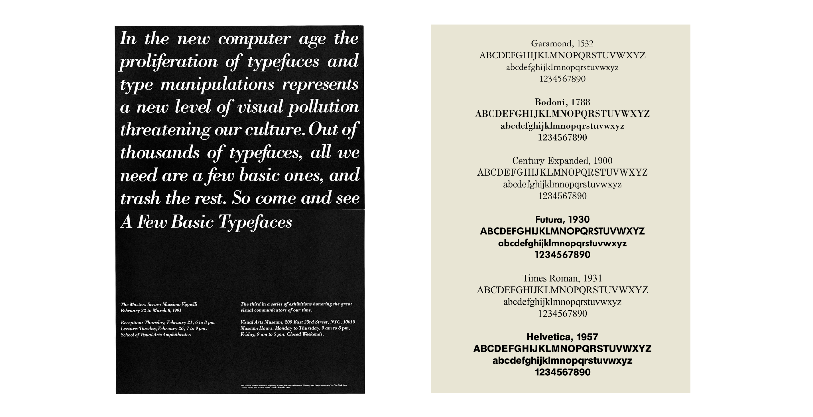
The above Massimo Vignelli poster announces the School of Visual Arts’ “third in a series of exhibitions honoring the great visual communicators of our time.” February 22 to March 8, 1991 at the Visual Arts Museum, here at 209 East 23rd Street. Massimo writes in the Vignelli Canon…
The exhibition showed work that we had done over many years by using only four typefaces: Garamond, Bodoni, Century Expanded, and Helvetica. The aim of the exhibition was to show that a large variety of printed matter could be done with an economy of type with great results. In other words, is not the type but what you do with it that counts.
I still believe that most typefaces are designed for commercial reasons, just to make money or for identity purposes. In reality the number of good typefaces is rather limited and most of the new ones are elaborations on pre-existing faces. Personally, I can get along well with a half a dozen, to which I can add another half a dozen, but probably no more. Besides those already mentioned, I can add Optima, Futura, Univers (the most advanced design of the century since it comes in 59 variations of the same face), Caslon, Baskerville, and a few other modern cuts. As you can see my list is pretty basic but the great advantage is that it can assure better results. It is also true that in recent years the work of some talented type designers has produced some remarkable results to offset the lack of purpose and quality of most of the other typefaces.
Further Reading: Massimo Vignelli’s A Few Basic Typefaces
Source: Fonts in use
Background
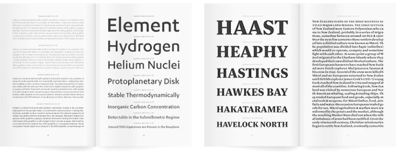
Specimen books are traditionally published by type foundries and printers to demonstrate the range and quality of their work. They are the printed brochures or catalogs of type foundries and printers, offered to advertise the range and quality of type available.
Type Specimen References & Examples
GT America
GT Eesti
GT Super
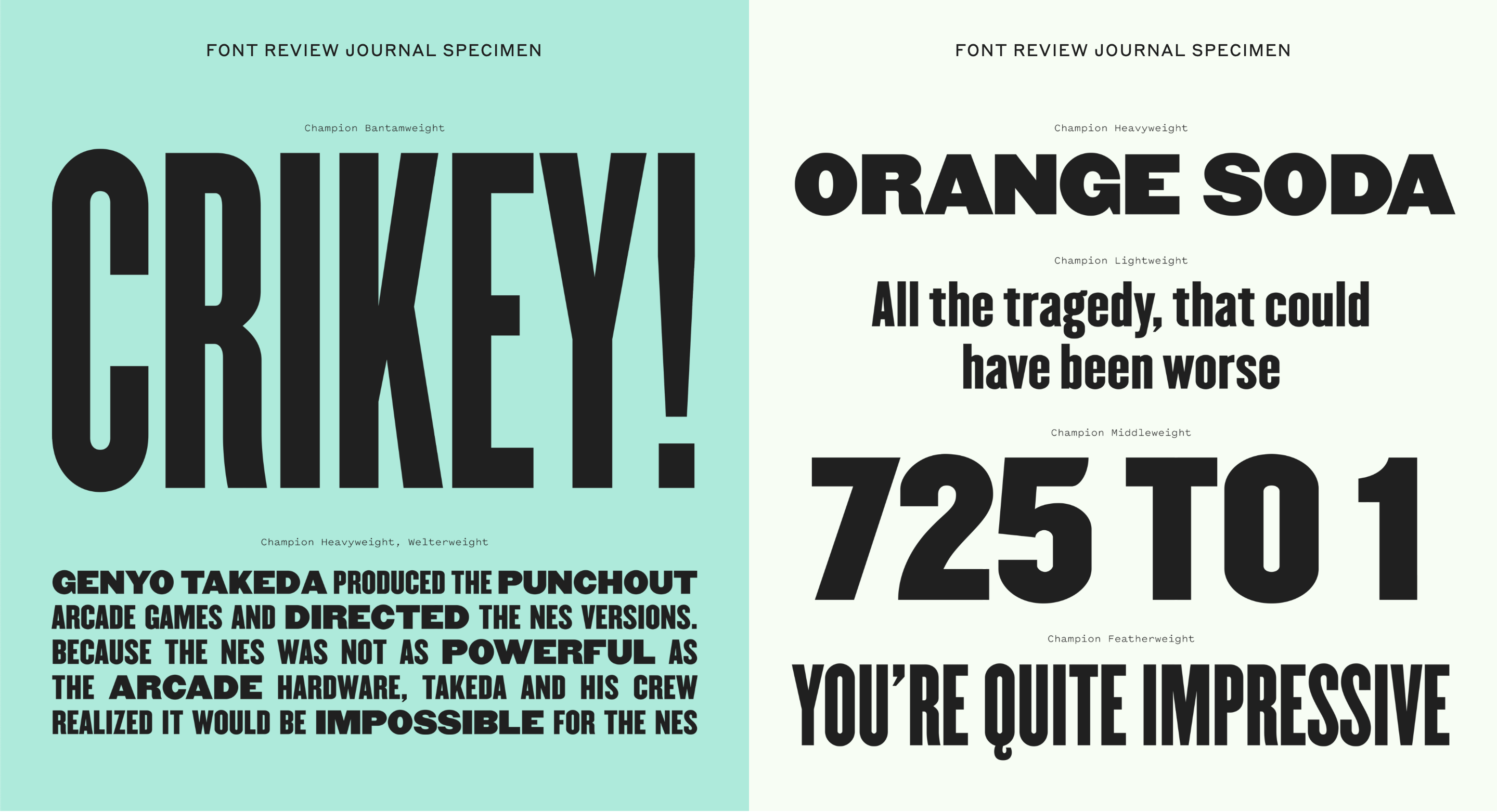
Font Review Journal
Typographica
Klim
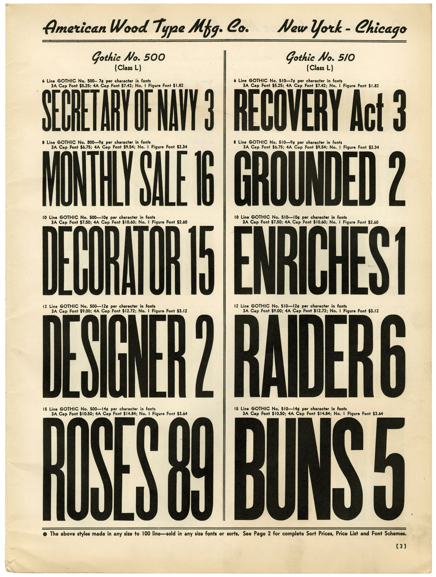
Example of a ‘waterfall’, showing the type increasing in larger increments
Background
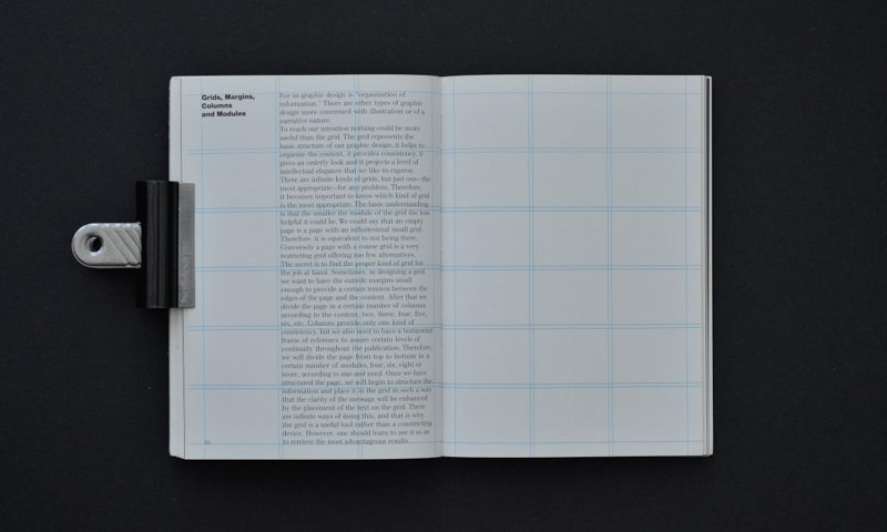
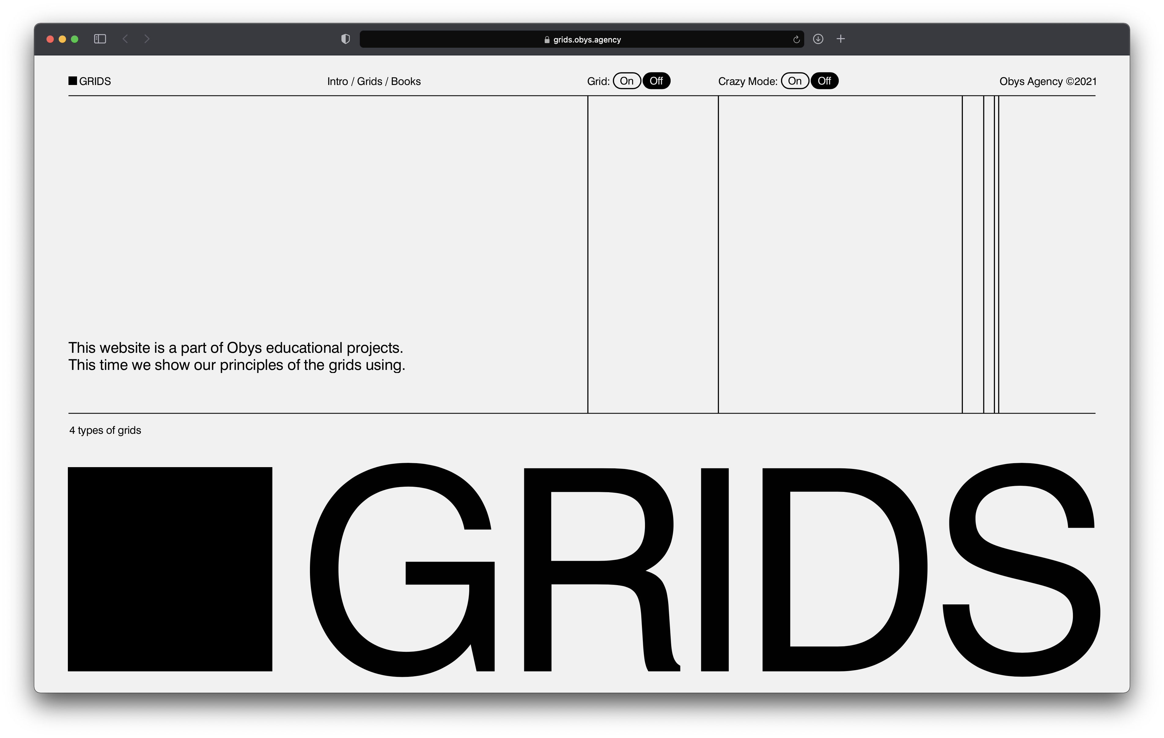
The Grid, as exemplified by Obys Agency. This site documents their different grid structures in various projects. “The grid divides an available surface into a number of proportioned subdivisions serving the needs of the work in hand, and provides a visual structure on which the design can be based. The grid makes it possible to bring all the elements of design - type, photography, illustration and colour - into a formal relationship to each other; that is to say, the grid system is a means of introducing order into a design. A deliberately composed design has a clearer, more neatly arranged and more successful effect than an advertisement put together at random. The grid system is an aid, not a guarantee. It permits a number of approaches, and each designer can look for a solution appropriate to the object in view and congenial to his personality. But one must learn how to use the grid system; it is something that has to be practised. Each task calls for a grid suited specially to itself. It must enable the designer to arrange the captions, photographs and illustrations so that they are each as visually effective as their importance warrants, but yet form an ordered whole.” — Josef Müller-Brockmann, The Graphic Artist and his Design Problems (link)
Background
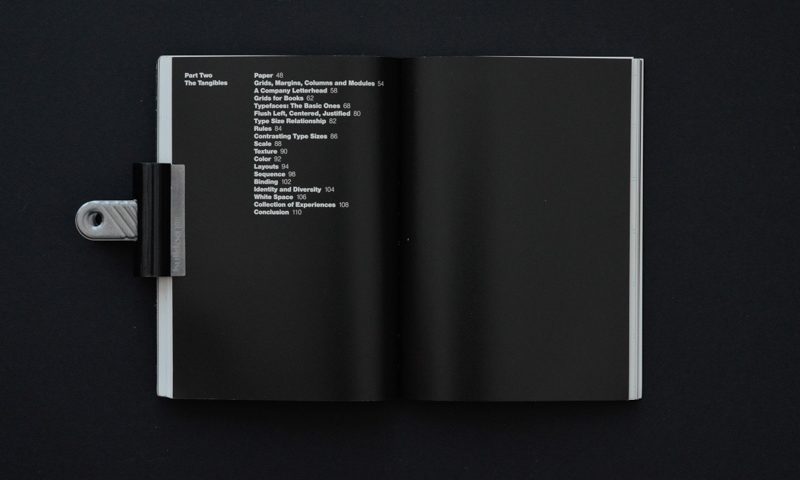
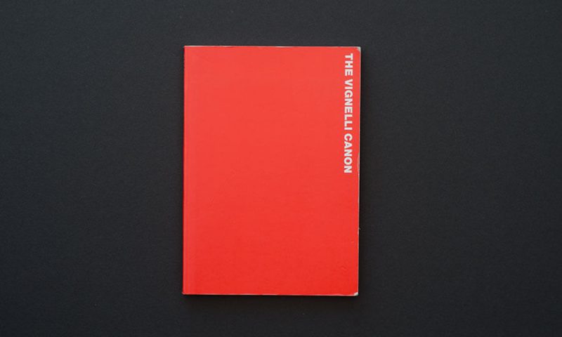
Published in 2010, The Vignelli Canon distills Massimo Vignelli’s core design principles into a holistic book. This is a great place to start if you’re struggling with your grid. Specifically, read Part II titled “The Tangibles”. Massimo goes over the various steps into designing a publication, deciding on an appropriate grid, and organizing information. (link)