Assignment 01
Letter Crops
Our first in class workshop will feature a letter crop exercise. On 8.5×11" paper, print a viewfinder, 10 copies of a single letter of Univers and 10 copies of a single letter of Bodoni. For example, if you choose Univers "a", print 10 "a‘s". Download your letters here.
Materials
Pen or Pencil
X–acto knife or cutting tool with #11 blades
Cork–backed ruler
Self healing cutting mat
Viewfinder
10 copies of a single Univers letter
10 copies of a single Bodoni letter
Instructions
Round 1, 45 minutes: Using your viewfinder, compose and cut 3 crops of your chosen Univers letterform. The goal is to create dynamic and interesting compositions. Each composition should feel different and unique.
Round 2, 10 minutes: Take feedback from the critique and create two more crops of your chosen Univers letterform. Revise your first three if necessary.
Round 3, 45 minutes: Compose and cut 5 crops of your chosen Bodoni letterform. Take what you‘ve learned from our critique and continue to develop interesting letter crops. Consider your Bodoni letterforms as a set with your Univers letterforms, and compose all ten crops on the wall for our final crit.
Learning Outcomes
1. Ability to follow instructions
2. Introduction to craft
3. Employing your vocabulary during crit
4. Understanding the difference between Sans and Serif typefaces
5. Learning to see
Background
In typography, a serif is a small line attached to the end of a stroke in a letter or symbol. A typeface with serifs is called a serif typeface (or serifed typeface). A typeface without serifs is called sans-serif or sans serif, from the French sans, meaning “without”. Some typography sources refer to sans-serif typefaces as “Grotesque” (in German “grotesk”) or “Gothic”, and serif typefaces as “Roman”.
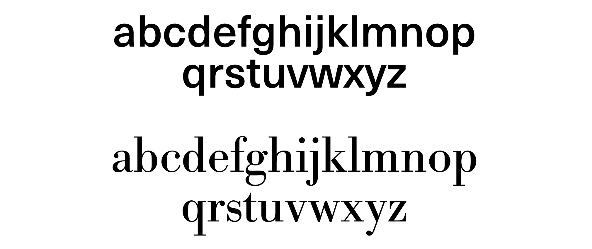
Univers designed by Adrian Frutiger (1957)
Univers was one of the first typeface families to fulfil the idea that a typeface should form a family of consistent, related designs. Past sans-serif designs such as Gill Sans had much greater differences between weights, while loose families such as American Type Founders' Franklin Gothic family often were advertised under different names for each style, to emphasise that they were not completely matching. By creating a matched range of styles and weights, Univers allowed documents to be created in one consistent typeface for all text, making it easier to artistically set documents in sans-serif type. This matched the desire among practitioners of the “Swiss style” of typography for neutral sans-serif typefaces avoiding artistic excesses. Source.
Bodoni designed by Giambattista Bodoni (1740–1813)
Bodoni is the name given to the serif typefaces first designed by Giambattista Bodoni (1740–1813) in the late eighteenth century and frequently revived since. Bodoni's typefaces are classified as Didone or modern. Bodoni followed the ideas of John Baskerville, as found in the printing type Baskerville—increased stroke contrast reflecting developing printing technology and a more vertical axis—but he took them to a more extreme conclusion. Bodoni had a long career and his designs changed and varied, ending with a typeface of a slightly condensed underlying structure with flat, unbracketed serifs, extreme contrast between thick and thin strokes, and an overall geometric construction.
When first released, Bodoni and other didone fonts were called classical designs because of their rational structure. However, these fonts were not updated versions of Roman or Renaissance letter styles, but new designs. They came to be called ‘modern’ serif fonts and then, until the mid-20th century, they were known as Didone designs. Bodoni‘s later designs are rightfully called “modern”, but the earlier designs are now called “transitional”. Source.
This has been adapted from an assignment given by Michael Ian Kaye at the School of Visual Arts. Thank you.