Assignment 01
Collection: Type Lockup’s
Part 1: Core Attributes
Imagining that your collection of images will be exhibited in a gallery or museum, create a visual identity through a series of methodical steps. Select 5 adjectives that for you characterize the meaning, tone, and primary aesthetic qualities of your collection as a whole. These adjectives will comprise your collection’s ‘core attributes’ and should be as specific to your collection as possible (i.e. they should not apply equally well to another person’s collection).
Example (speculative core attributes for Apple advertisements)
• Bold
• Simple
• Fun
• Precise
• Seductive
Part 2: Collection Titles
Next, create a list of 3 possible titles for your collection. The title will greatly affect your collection’s character so consider them carefully; their length, tone, opportunities for word-play, the visual shapes of words and letters. If your title is metaphorical or abstract consider adding a more descriptive subtitle to clarify its meaning.
Examples (recent MoMA exhibition titles)
• Taking a Thread for a Walk
• Private Lives Public Spaces
• Small Scale, Big Change: New Architectures of Social Engagement
• Engineer, Agitator, Constructor: The Artist Reinvented
• Just Above Midtown: 1974 to the Present
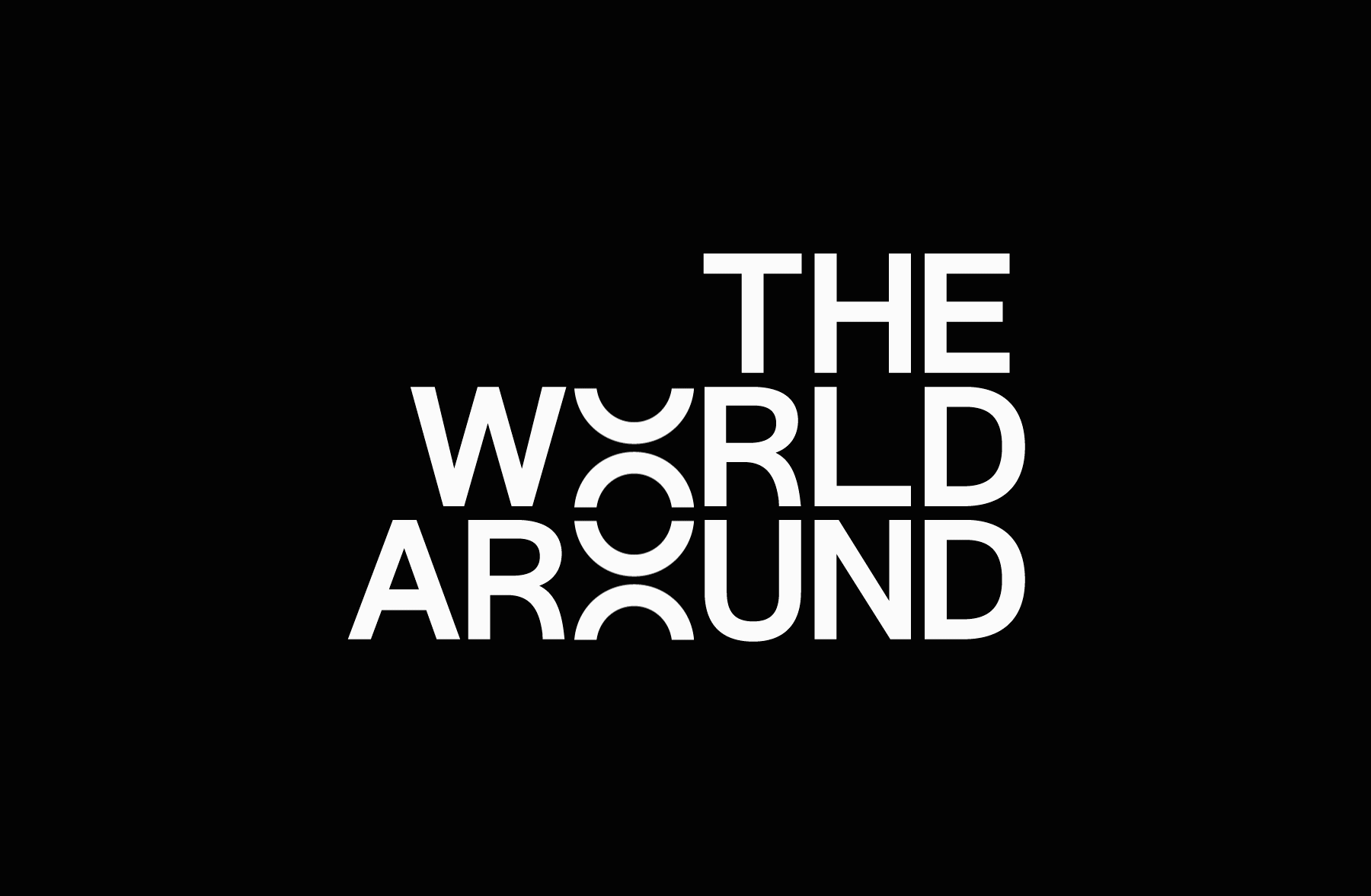
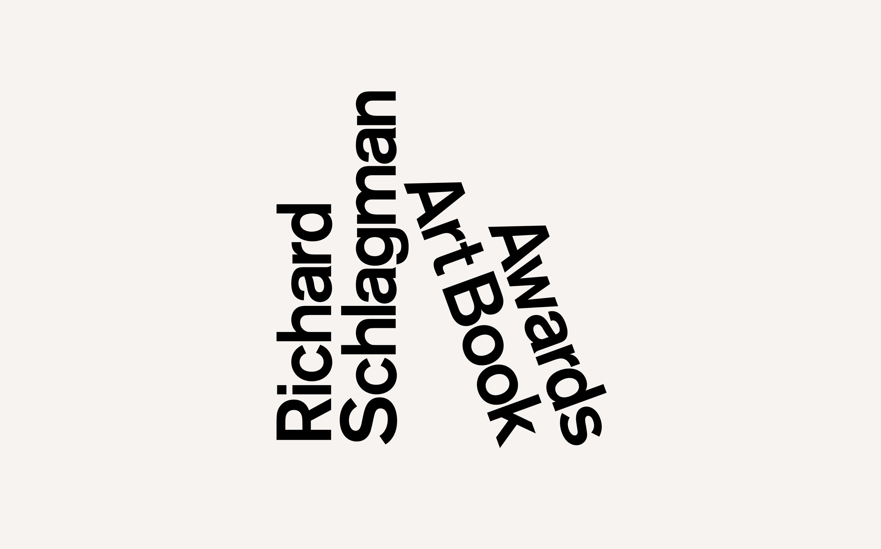
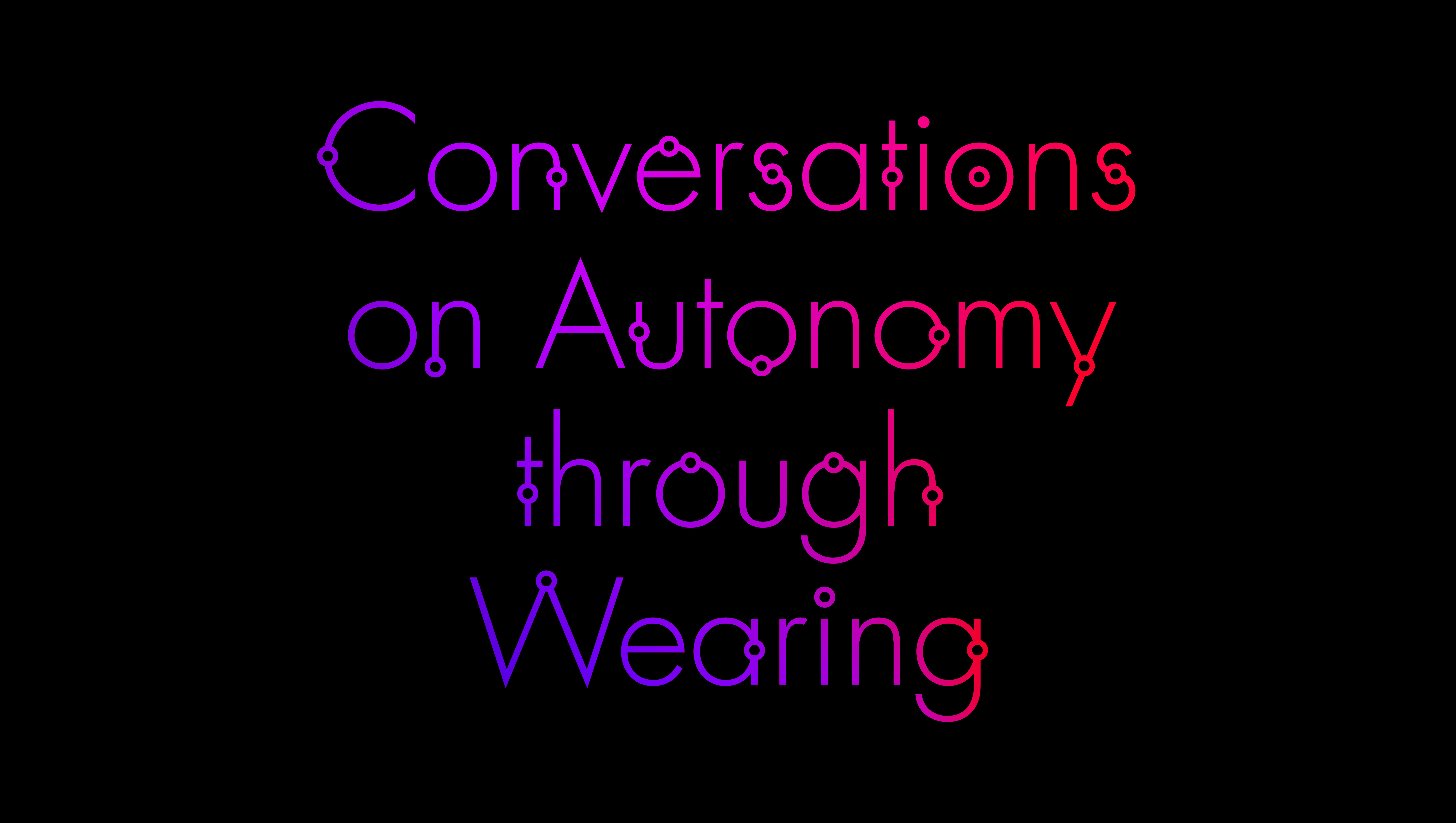
Part 3: Type System
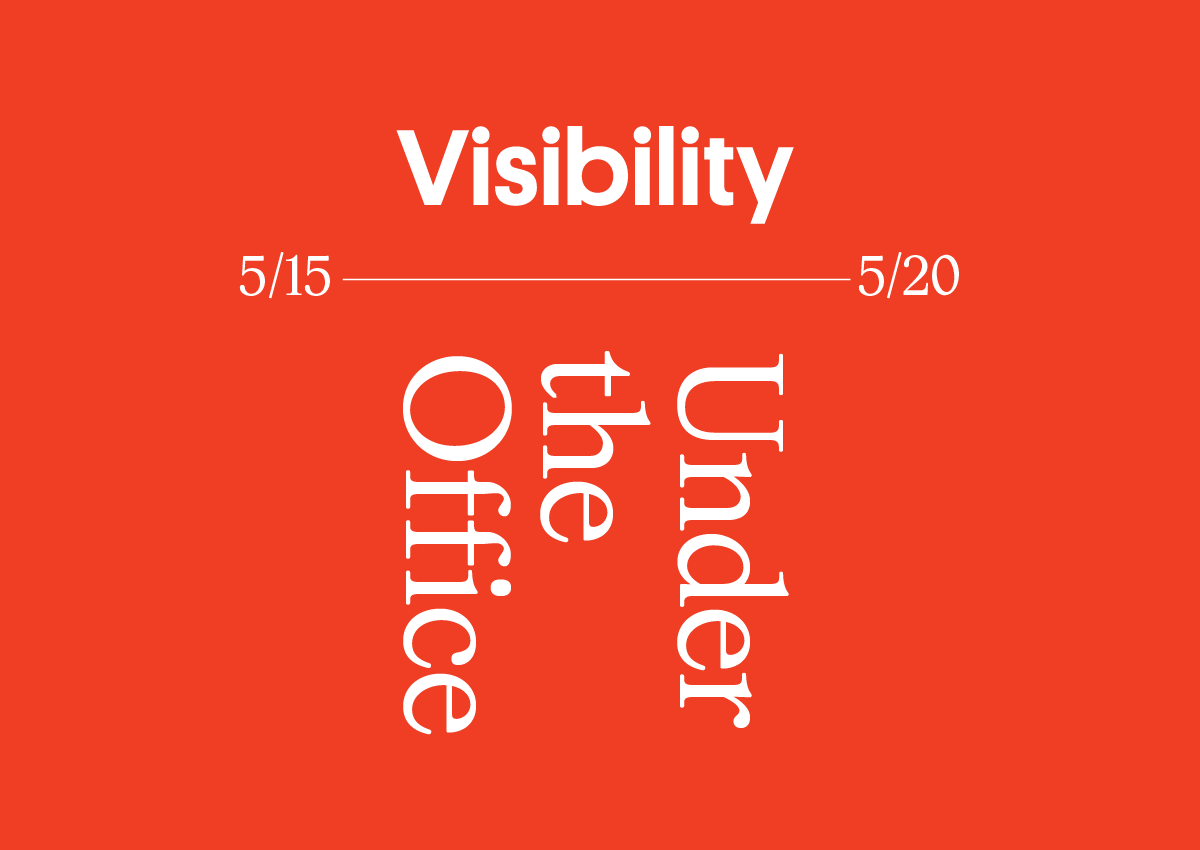
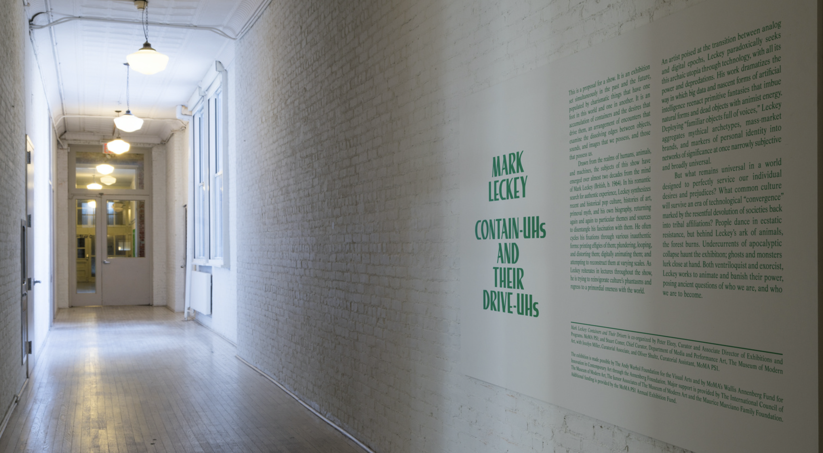
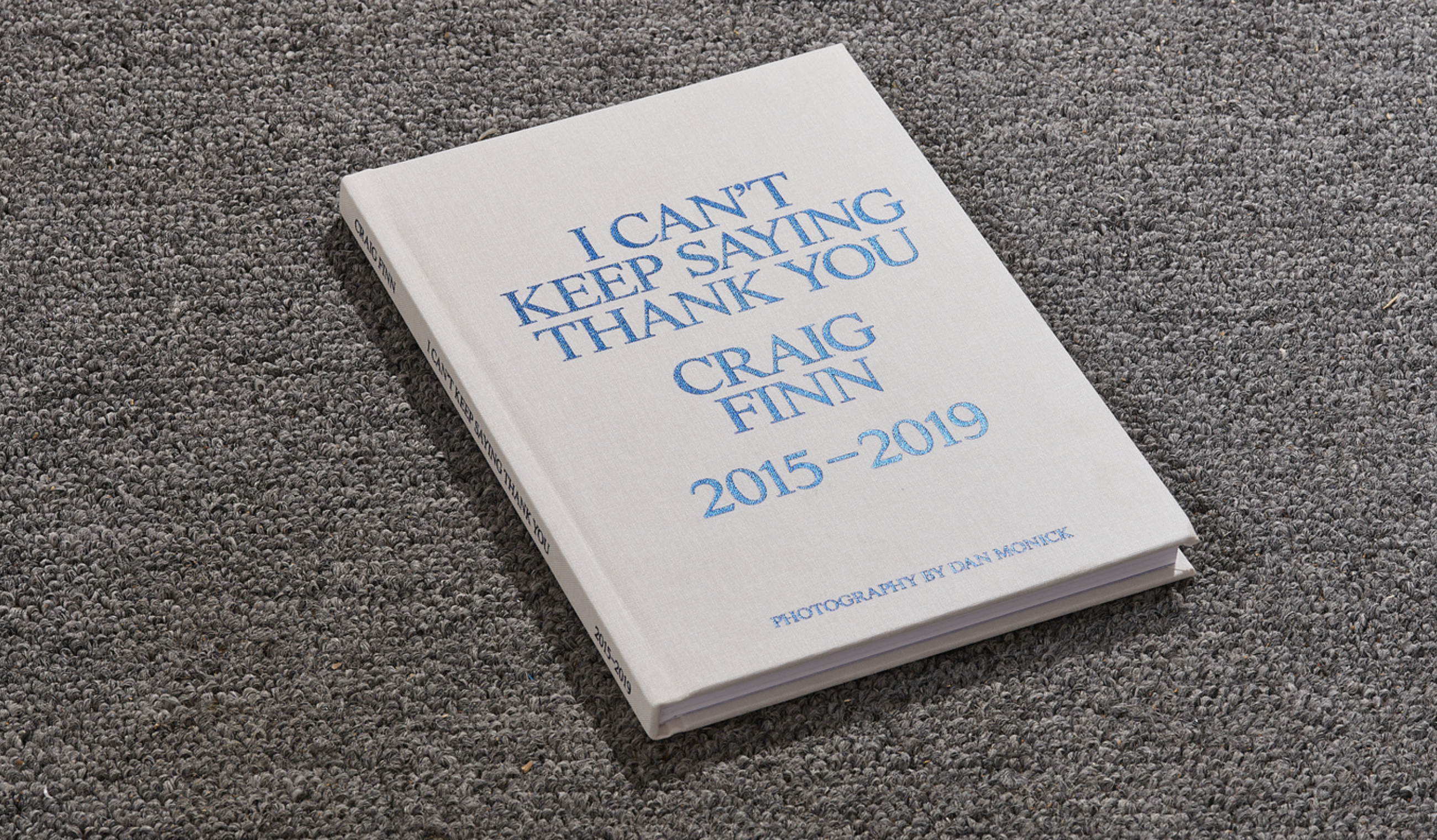
Choosing one of your collection titles, define a typographic system for your collection. Where a ‘logotype’ implies the typographic design of just one word or name, a ‘type lock-up’ is the typographic composition of a set of words.
Begin by searching for suitable typefaces from the list of foundries below. Think about how the formal qualities of the letters themselves might relate to your core attributes. Select 4 different typefaces and type-set the same collection title in each.
Then shift your attention to how the composition of the words in your title can affect their meaning. For each typeface you select, create a different typographic composition. This should not be overly designed, remember you are not making a logo, you are defining a set of rules and composing your typography. The minute details are the most important. We are most concerned with kerning, leading, experiment with all uppercase or all lowercase letters, a mix of the two, try emphasizing key words or letters through changes in font weight, scale, spacing, placement, etc.
As you experiment, prioritize those attributes that are inherently visual and ask yourself whether your design reflects their meaning. Consider whether additional shapes, lines or textures might be intergrated into your design to add emphasis or articulate an idea that can’t be embodied in the type alone.
Classics
• Monotype
• Linotype
• ITC
• URW++
Contemporaries & Independents
• Commercial Type
• Klim Type Foundry
• Grilli Type
• Colophon Foundry
• Optimo
• Lineto
• Tobias Frere-Jones
• Hoefler & Co.
• Open Foundry (decent, free fonts)
• Dinamo
Summary
Print your 5 core attributes and 3 collection titles in two separate lists on a sheet of letter-sized paper. Print your 4 type lock-up designs on letter-size paper, 1 per page, listing the name of each typeface used at the bottom.
Background
A ‘logotype’ or ‘wordmark’ implies the typographic design of just one word or name, a ‘type lock- up’ is the typographic composition of a set of words. Experiment with all uppercase or all lowercase letters, a mix of the two, try emphasizing key words or letters through changes in font weight, scale, spacing, placement, etc. Consider the whole, and unless conceptually sound, keep it simple.
Pentagram
Mike Tully
Vance Wellenstein
2×4