Assignment 03
Expressive Form: Paragraph
Design a publication featuring at least 50 of your type compositions. Along with your experiments, you must typeset the essay “The Crystal Goblet” by Beatrice Warde. The essay must be set in your chosen typeface.
Refine and edit your experiments. What was working last week? What wasn’t? Make changes to old experiments and develop new compositions. Don’t be precious, constructively criticize your work and keep pushing yourself.
Design your book using InDesign, with an 8×10" page size. Pace out your initial experiments in a considered order. Typeset “The Crystal Goblet” from beginning to end. Your page count will largely be decided based on your margin design and text size. Watch this tutorial on flowing text. Lastly design a front and back cover.
Print your publication to scale, black & white in sequence. This will allow us to flip through your book in order. Bind your pages loosely with binder clips.
Background
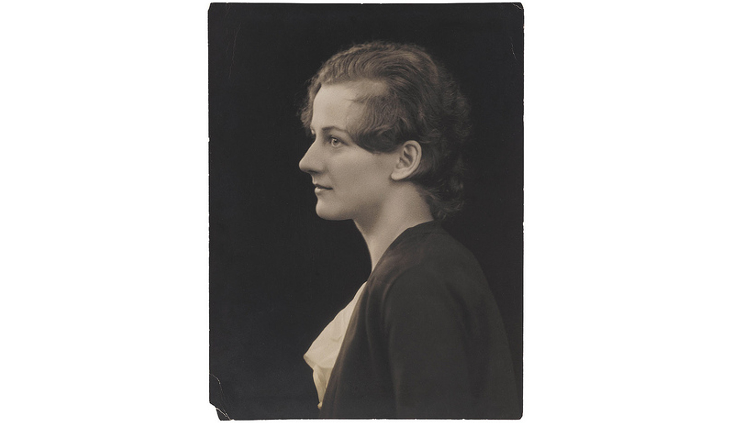
Beatrice Lamberton Warde (September 20, 1900 – September 16, 1969) was a twentieth century writer and scholar of typography. As a marketing manager for the British Monotype Corporation, she was influential in the development of printing tastes in Britain and elsewhere in the mid-twentieth century and was recognized at the time as “one of the few women typographers in the world”. Her writing advocated higher standards in printing, and championed intelligent use of historic typefaces from the past, which Monotype specialised in reviving, and the work of contemporary typeface designers.
“The Crystal Goblet” (1932) is rich with metaphors. The title itself is a reference to a clear vessel holding wine, where the vessel, the printed word, gives no obstruction to the presentation of its content, the text. Warde poses a choice between two wine glasses: one of “solid gold, wrought in the most exquisite patterns” and one of “crystal-clear glass.”
Now the man who first chose glass instead of clay or metal to hold his wine was a “modernist” in the sense in which I am going to use that term. That is, the first he asked of this particular object was not “How should it look?” but “What must it do?” and to that extent all good typography is modernist.
Throughout the essay, Warde argues for the discipline and humility required to create quietly set, “transparent” book pages. Source