Assignment 03
Expressive Form: Experiment
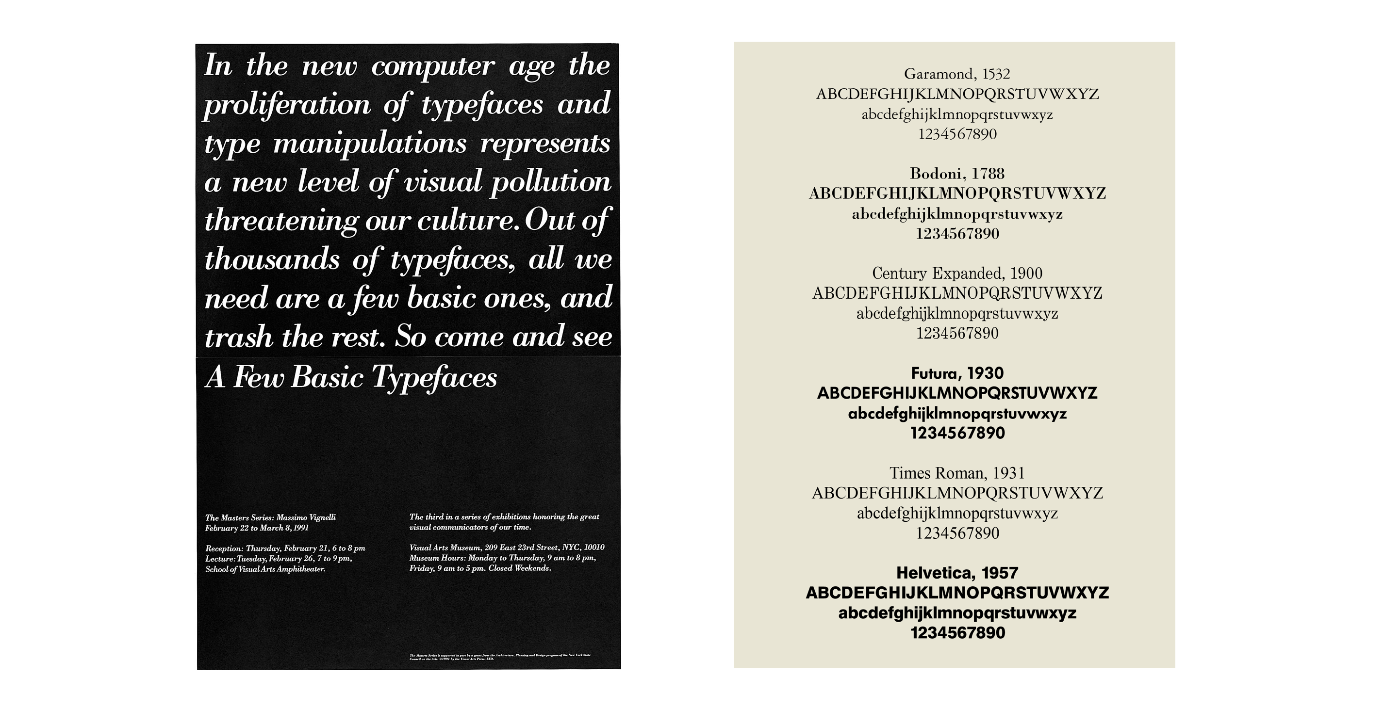
Massimo Vignelli is infamous for using a specific set of typefaces throughout his work. He has his favorites, but for this assignment you must choose one of the following...
1. Garamond
2. Bodoni
3. Futura
4. Times New Roman
5. Helvetica
6. Univers
Next week show 100 unique typographic experiments investigating this typeface. Consider your letter crop assignment as the first stage of your investigation. Employ the fundamentals of composition we discussed during our critique. Also consider letter choice. All characters are up for grabs: number, letter, or punctuation mark.
Your experiments should be 8×10". These experiments can consist of found footage, self made imagery, and existing typography. Whatever the outcome, your experiment should formally resemble or connect with the letterforms of your typeface.
Each composition can only use a single letterform, similar to your letter crops. One character only, without repetition or duplication. Analyze every curve and edge to your typeface. Find what's interesting and enhance it. Your only restriction is that your compositions must be 100% black & white, meaning remove any grey values. A quick and easy way to do this to images in posterization in photoshop.
To summarize: bring in your 100 black & white compositions printed at 8×10". We will discuss in the round, do not hang your work for our crit.
Background
The above Massimo Vignelli poster announces the School of Visual Arts’ “third in a series of exhibitions honoring the great visual communicators of our time.” February 22 to March 8, 1991 at the Visual Arts Museum, here at 209 East 23rd Street. Massimo writes in the Vignelli Canon…
The exhibition showed work that we had done over many years by using only four typefaces: Garamond, Bodoni, Century Expanded, and Helvetica. The aim of the exhibition was to show that a large variety of printed matter could be done with an economy of type with great results. In other words, is not the type but what you do with it that counts.
I still believe that most typefaces are designed for commercial reasons, just to make money or for identity purposes. In reality the number of good typefaces is rather limited and most of the new ones are elaborations on pre-existing faces. Personally, I can get along well with a half a dozen, to which I can add another half a dozen, but probably no more. Besides those already mentioned, I can add Optima, Futura, Univers (the most advanced design of the century since it comes in 59 variations of the same face), Caslon, Baskerville, and a few other modern cuts. As you can see my list is pretty basic but the great advantage is that it can assure better results. It is also true that in recent years the work of some talented type designers has produced some remarkable results to offset the lack of purpose and quality of most of the other typefaces.
Further Reading: Massimo Vignelli’s A Few Basic Typefaces
Source: Fonts in use