Assignment 02
Typographic Heirarchy
Organizing information visually—making it accessible, legible, and coherent—is a core graphic designer’s skill that, like drawing, requires continuous practice.
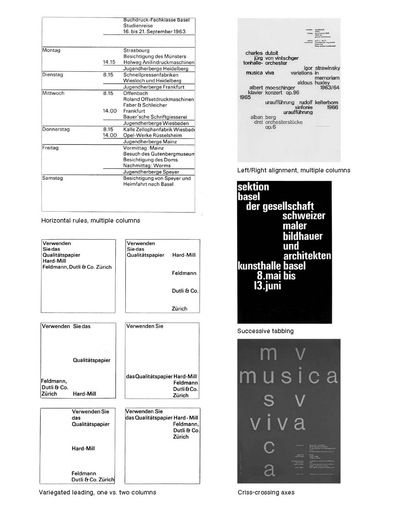
Based on the concept of ‘theme and variation’, create 6 typographic studies (3 sets of pairs) for a hypothetical ad using these type specimens.
Determine the appropriate visual hierarchy of the information. Then make a series of typographic compositions that explore and express these hierarchies in a multitude of ways, applying the principles of abstract composition explored in your previous assignments.
You may break up lines into individual words, or even letters, and place them anywhere on the grid, and place them vertically or horiztonally. In each composition, look to articulate just one primary visual theme, such that all the elements on the page relate to it in some way. For example, you might explore ‘tabbing’ in one compositional pair, ‘centered alignment’ in a second, and ‘columns’ in a third.
The following are just a few of the many typographic and/or compositional attributes that could serve as the basis of a visual theme:
— leading (vertical letter spacing)
— tracking (horizontal letter spacing)
— paragraph alignment (left, right, centered, justified)
— indents/hanging indents (tabbing)
— columns (single, multiple)
— symmetrical or asymmetrical page composition
— edges (including cropping)
Make 3 compositional pairs, each pair exploring the same underlying theme, 6 total. When your collaged compositions are complete, photocopy or scan each onto a seamless sheet of letter-sized (8.5×11") paper for presentation. Also bring in your original, collaged compositions. Finally, your ads must adhere to the following restrictions:
— Theme 1 (set of 2)
Any one type size in any one weight (e.g. 26 pt Medium)
— Theme 2 (set of 2)
Any two type sizes in the same weight (e.g. 14 & 19 pt Bold)
— Theme 3 (set of 2)
Any two type sizes each in a different weight (e.g. 26 pt Regular & 14 pt Bold)
*rules can be used in one of your 3 themes
Week II
We will review what you’ve made in class and discuss your work. Take what you’ve learned from the class critique and apply them to your second round. Bring 6 compositions total, continuing to follow the rules above.
— 3 sets of two themes 8.5×11"
— photocopyed or scanned
— on a seamless 8.5×11" sheet
Background
The passage above is a scan of “Typographie: A Manual of Design” by Emil Ruder. Read the rest of this chapter on theme & variation.
Emil Ruder was a typographer and graphic designer who, born in Switzerland in 1914, helped Armin Hofmann form the Basel School of Design and establish the style of design known as Swiss Design. He taught that, above all, typography’s purpose was to communicate ideas through writing. He placed a heavy importance on sans-serif typefaces and his work is both clear and concise, especially his typography.
Like most designers classified as part of the Swiss Design movement he favored asymmetrical compositions, placing a high importance on the counters of characters and the negative space of compositions. A friend and associate of Hofmann, Frutiger and Müller Brockmann, Ruder played a key role in the development of graphic design in the 1940s and 50s. His style has been emulated by many designers, and his use of grids in design has influenced the development of web design on many levels. Source.
This has been adapted from an assignment given by Julien Bittner at Yale University. Thank you.