Assignment 04
Form & Function: Week 1
Prompt—
Find something overly complicated and simplify it.
Next week, in the form of a PDF presentation, present your overly complicated thing and explain why you think it is more complicated than it needs to be. Next re-examine, refine, resolve and re-design your chosen thing 20 different ways. Explain in detail using sketches, mock-ups, photoshop, etc. Border on the obsurd, explore all possible options and scenarios. We will discuss which solution works best (if any) and you will continue the design process for the rest of the assignment.
Presentation Requirements
10 pages analyzing your thing
— 5 pages should analyze formal qualities (the way it looks)
— 5 pages should analyze functional qualities (the way it works)
— Analysis means observing what you believe is or isn’t working
5 page minimum for each solution
— 5 pages × 20 solutions is 100 pages
Pick something ubiquitous. It can be an object, a process, something you use all the time and think could be better… Think small, the little pleasures, the tiny tasks you wish were easier to execute. Look around you for inspiration, maybe something you use daily or weekly. Think about things that annoy you, the things you wish were different. If it exists and is man made, then it was designed by someone. Whatever the case, don’t pick something that is systemic or larger than life (for example, re-considering the MTA subway card and digital interface). If you’re stuck, a piece of graphic design is not out of question. Maybe a record cover or book cover you always thought could represent the content more closely, a digital interface you use all the time and think could use some love, a logo and identity system that feels out of line for the product. For the most part, this is not about designing a better mouse trap. Decide if what you’re working towards is necessary.
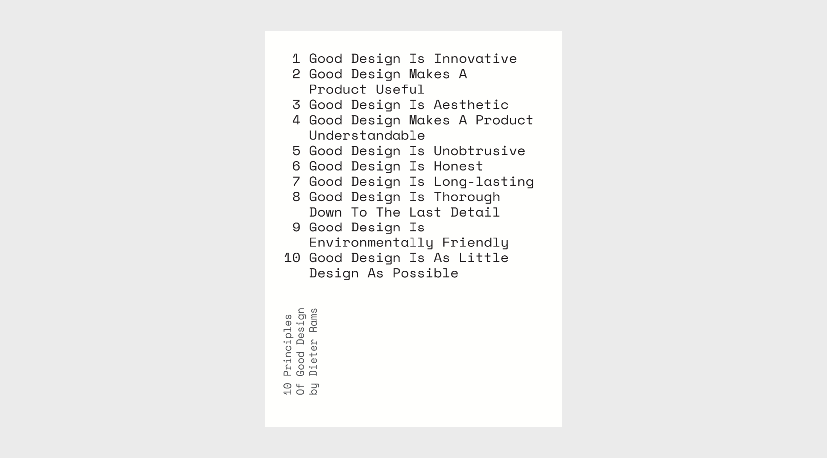
Above is “10 Principles of Good Design” by Dieter Rams, a celebrated modernist German designer. His lens is product design, Dieter is famous for designing shelving systems, record players and audio equipment, furniture and other objects. His process has been fetishized by many, especially in the digital design world, but his principles are a good starting point for identifying why something’s design is or isn’t working.
Every designer should be as detail oriented as James Hoffman, former World Barista Champion, author, and co-founder of Square Mile Coffee Roasters. His critique of one apps UI at 8 minutes and another at 10 minutes is worth noting. The highlight is 22 minutes in, where his frustration is at a boiling point. Behind every design is someone using or interpreting the designers decisions and intentions.
Above is The Way Things Go (German: Der Lauf der Dinge), a 1987 art film by the Swiss artist duo Peter Fischli and David Weiss. It documents a long causal chain assembled of everyday objects, resembling a Rube Goldberg machine. Rube Goldberg machines make every day tasks hilariously and absurdly complicated.