Assignment 03
Type Anatomy Posters
You will be assigned a typeface in class. You will be studying it’s anatomy. Your analysis should be of this typeface’s regular weight. You’ll be making a total of 26 posters, all printed at 11×17".
Complete pages 1–21 found in the InDesign document provided. Replace ‘Helvetica’ with your typeface. Don't change any letters or the case in which they’ve been set. Start by establishing which point size will fit (test the uppwecase ‘W’). All typefaces vary, character heights and widths are all different so you’ll need to either make small or significant adjustments. Also adjust the ‘guides’ layer to match your typefaces cap height, x-height, baseline and descender line. All guides and description text can be found in ‘Master Page A’.
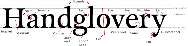
Next annotate 4 characters of your chosen typeface. You can choose from upper case, lower case or numerals. Each character must have at least 3 annotations. Look for consistencies (or variations) in the letterforms and try to understand the system the typographer has built into the shapes. Look for obvious decisions as well as the most subtle, they're all valid. You can annotate objective comments, such as “The capital O is almost a perfect circle” or subjective comments such as “this lowercase E feels more rigid because it’s ‘finial’ is cut at a perfectly straight angle”. Use the Indesign template provided.
Along with your 21 letter studies and 4 annotated letters you need to bring a typeface specimen poster with all letters, numbers and major punctuation upper and lower case of your typeface. The design and layout is up to you. Include the foundry and who designed or revived the typeface. Also include a description of the typeface, either from the foundry of of your own analysis. Focus on it’s history, why it’s relevant and why you like (or don’t like) it. Think of this as a poster promoting the typeface.
➺ Download your template here
Deliverables
21Letter Studies
4Letter Annotations
1Typeface specimen poster
Background
There are a few resources I would highly recommend to get you started. You should get Karen Cheng’s Designing Type or take it out from the library. It’s an amazing resource for anyone interested in the subject and a huge advantage for this project. Make sure to research type anatomy terms so your notes follow convention. Below are some images that will get you started.