Type Design I
DSD–3611–E
Philip DiBello
Tuesdays
03:20PM – 06:10PM
09/04/18 – 12/11/18
School of Visual Arts
209 East 23 Street
Room 304
Assignment 02
Maus Book
Read the essay ‘Heaven is Real’: John Maus and the Truth of Pop. You are to make two printed editions of the essay. Interpret the text when making design decisions such as defining your grid, choosing a typeface and gathering content, images or resources. Consider your interpretation of the text when choosing size, format, printing technique, binding, etc.
There are specific requirements for both editions. Both publications should have a title page, discography section and colophon. They must also have running headers and folios for the text section. Edition one requires you to use as little agency as possible. Edition two requires you to use as much agency as you would like.
The goal here becomes simple when we break the two editions down to their essence. Consider Rock’s essay Designer as author. He outlines multiple variations on the design process. Your editions need to occupy two different spaces. One can be operating in the space of “designer as performer” and the other in “designer as translator”. There are no right or wrong answers, but the editions should occupy different processes and approaches.
Our North Star is Wim Crouwel and Jan Van Toorn’s “The Debate” (pg. 19–42). Some 20 years before Rock wrote Designer as Author, Crouwel and Van Toorn we’re discussing the designers role within the process.
Crouwel plays a hybrid between “translator” and “performer”. His work is unmistakably of it’s time. It’s a realization of modernism and translation.
Van Toorn has a sharp viewpoint. He makes that known through the work. Much like Maus, Van Toorn uses the project as a vehicle to express social issues. His expression of the message places his work closer to the “author” or “auteur”.
Deliverables
Two editions following the rules above
—Title page
—Discography section
—Colophon
—Size and format of your choosing
Timeline
Week 2 — 9.11.18
Maus Book Assigned
Week 3 — 9.18.18
Maus Book R01
Bring in three notes or highlights from the reading. Print out your editions to scale. Bring in a few different spreads so we can see your type setting and general design system for each edition. Also bring in some sketches for a cover. Be ready to explain how your decisions relate to your interpretation of the text and how you're ‘agency’ comes into play. We will review them as a class, focusing on concept and execution.
Week 4 — 9.25.18
Maus Book R02
Print out your editions in full, all pages typeset and designed single sided and bound loosely with binder clips or other fasteners. Have your cover fully considered. You need to start thinking about your book as an object. Consider binding and production techniques. This class’ crit will be focused soley on design details.
Week 5 — 10.2.18
Maus Book R03
Print out your editions in full, all pages typeset and designed single sided and bound loosely with binder clips or other fasteners. Have your cover fully considered. You need to start thinking about your book as an object. Consider binding and production techniques. This class’ crit will be focused soley on design details.
Checklist —
➺ Format and thickness
➺ Proportions of Spread
➺ Margins & Grid
➺ Typeface Selection
➺ Text Setting
➺ Paper, Printing, Production
➺ Binding
➺ Front & Back Covers
➺ Object Quality as a Whole
Week 6 — 10.9.18
Maus Book R04
Two editions in complete form. Printed and bound perfectly.
Background
John Maus (born February 23, 1980) is an American avant-garde musician, and composer. A keyboard player for Panda Bear and Ariel Pink, he has released three albums of his own music to acclaim. He grew up in Minnesota. He is known for his eclectic samples when composing, “an almost absurd mix – a stand-off between taut, bass-driven post-punk, whooshing electro-pop and, thanks to the chants and bleak intoning, Medieval and Gregorian disco.”
Charles Ubaghs 2012 review for the BBC also took notice of the philosophical undertones of Maus’ works: “...behind these retro overtones is a desire to explore our modern relationships with pop, and its impact on our wider philosophical and cultural lives.” The review also remarked that on Maus’ self-referential tendencies: “Couple this with lyrics like The Fear’s surprisingly frank “What’s wrong with me, ‘cause I’ve tried everything,” and you’ve an accessibly rich portrait of Maus’ ever-questioning mind.” Likewise a 2011 BBC review noted that Maus was “ as much a professional existentialist as he is a synth-pop musician” and that “reading his interviews can make your cerebral cortex pulse with befuddlement.”
Maus has found vehicle in pop music to express his ideas and philosophies. His work lives in an odd cross section of nostalgia and contemporary music. Fans have made unofficial music videos, creating juxtapositions from old films and other media that fittingly work with Maus' songs like the above example, remixing footage from the 1991 film 'Cool As Ice'.
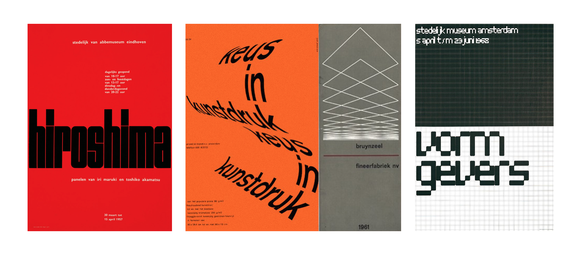
Wim Crouwel
is a Dutch graphic designer, type designer, and typographer. Between 1947 and 1949, he studied Fine Arts at Academie Minerva in Groningen, the Netherlands. In addition, he studied typography at what is now the Gerrit Rietveld Academie in Amsterdam. Crouwel's graphic work is especially well known for the use of grid-based layouts and typography that is rooted in the International Typographic Style.
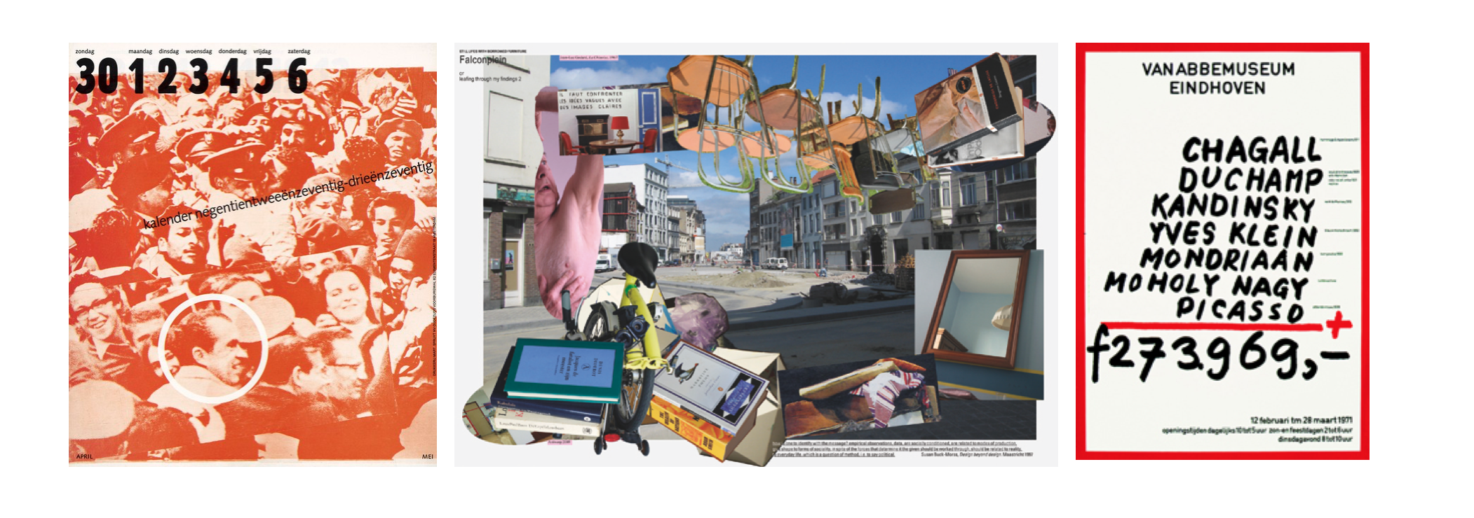
Jan van Toorn
is a Dutch graphic designer. His designs persistently call attention to their status as visual contrivances, obliging the viewer to make an effort to process their complexities. Van Toorn wants the public to measure the motives of both the client and the designer who mediates the client’s message against their own experiences of the world. He hoped in this way to stimulate a more active and skeptical view of art, communication, media ownership and society. Projects such as Van Toorn’s posters and catalogues for the Van Abbemuseum in Eindhoven and his long-running series of calendars for the printing firm Mart.Spruijt are powerful demonstrations of graphic design used as a means of commentary and as a tool of critique.