Assignment 02
Letter Crop
Your second assignment is to make 20 compositions of cropped letterforms. Your compositions must be 6x6" squares. They can be designed on the computer. The final versions must be mounted on ⅛" white foam core, full bleed. No borders.
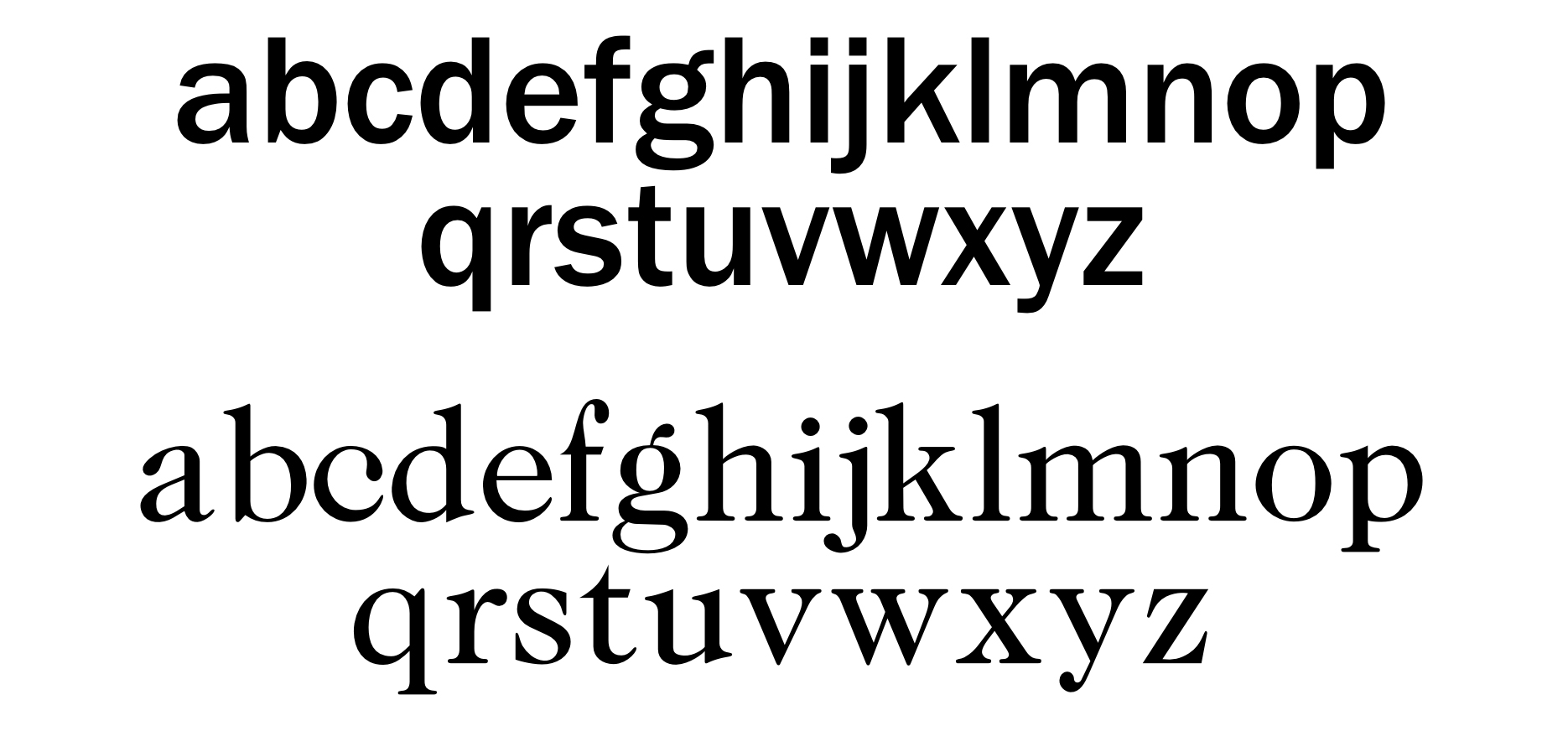
10 of these compositions should use the sans-serif typeface ‘Franklin Gothic Medium’ (which you can download here). Choose one letter, and make your 10 compositions with the letter chosen. You can only select a lowercase letter (no capitals, punctuation or numerals). Your letterform should be 100% white. Your background should be 100% black. No color, no exceptions. No skewing or distorting the letter. Only one letterform in your composition.
The other 10 compositions should use the serif typeface ‘ITC Caslon No. 224 Book’ (which you can download here). Choose one letter, and make your 10 compositions with the letter chosen. You can only select a lowercase letter (no capitals, punctuation or numerals). Your letterform should be 100% black. Your background should be 100% white. No color, no exceptions. No skewing or distorting the letter. Only one letterform in your composition.
Deliverables
20 compositions, 6x6"
mounted on ⅛" foamcore
— 10 Sans-serif using ‘Franklin Gothic Medium’
— 10 Serif using ‘ITC Caslon No. 224 Book’
Recommended Materials
⅛" (one eighth inch) thick foamcore, white
Double tack (double-sided sticky adheasive sheet)
X–acto knife or cutting tool with #11 blades
Cork–backed ruler
Self healing cutting mat
Background
In typography, a serif is a small line attached to the end of a stroke in a letter or symbol. A typeface with serifs is called a serif typeface (or serifed typeface). A typeface without serifs is called sans-serif or sans serif, from the French sans, meaning “without”. Some typography sources refer to sans-serif typefaces as "Grotesque” (in German “grotesk”) or “Gothic”, and serif typefaces as “Roman”.
Franklin Gothic by Morris Fuller Benton
Franklin Gothic and its related faces are a large family of realist sans-serif typefaces developed by the type foundry American Type Founders (ATF) and credited to its head designer Morris Fuller Benton. “Gothic” was a contemporary term (now little-used except to describe period designs) meaning sans-serif.
Franklin Gothic has been used in many advertisements and headlines in newspapers. The typeface continues to maintain a high profile, appearing in a variety of media from books to billboards. Despite a period of eclipse in the 1930s, after the introduction of European faces like Kabel and Futura, they were re-discovered by American designers in the 1940s and have remained popular ever since. The original family is a set of solid designs, particularly suitable for display and trade use such as headlines rather than for extended text. Many versions and adaptations have been made since. Learn More.
ITC Caslon No. 224 by Edward Benguiat
The Englishman William Caslon (1672-1766) first cut his typeface Caslon in 1725. His major influences were the Dutch designers Christoffel van Dijcks and Dirck Voskens. The Caslon font was long known as the script of kings, although on the other side of the political spectrum, the Americans used it as well for their Declaration of Independence. The characteristics of the earlier Renaissance typefaces are only barely detectable. The serifs are finer and the axis of the curvature is almost or completely vertical. The overall impression which Caslon makes is serious, elegant and linear. Next to Baskerville, Caslon font is known as the embodiment of the English Baroque-Antiqua and has gone through numerous new interpretations, meaning that every Caslon is slightly different. ITC Caslon 224 was designed by Edward Benguiat and appeared with ITC in 1982. It is the text font which expanded upon the title font ITC Caslon 223. The alterations in the proportions of the letters make this Caslon 224 a noticeable departure from the original, but make the font overall more legible. Learn More.