Type Design II
DSD-3612-C
January 10, 2017–April 25, 2017
Tuesday 03:00PM–05:50PM
209 E 23 St, Room 506
Assignment 03
Typeface Poster Series
Choose a typeface you're drawn to. It could be something you enjoy using or something that intrigues you, but don't pick something you're too familiar with. You'll be studying it's anatomy. Whichever typeface you choose, your analysis should be of a single weight. You'll be making a total of 16 posters, all printed at 11x17in.
Complete the 5 uppercase letter studies found in the InDesign document provided. Replace 'Akzidenz Grotesk' with your chosen typeface. Don't change any letters, use the ones already on pages 1-5. Start by establishing which point size will fit (test the uppwecase 'W'). All typefaces vary, character heights and widths are all different so you'll need to either make small or significant adjustments. Also adjust the 'guides' layer to match your typefaces cap height, x-height, baseline and descender line. I put all the guides in 'Master Page A', along with the type information which should be on every page. Take care to align the stroked letterforms with the grey filled letters and look for relationships.
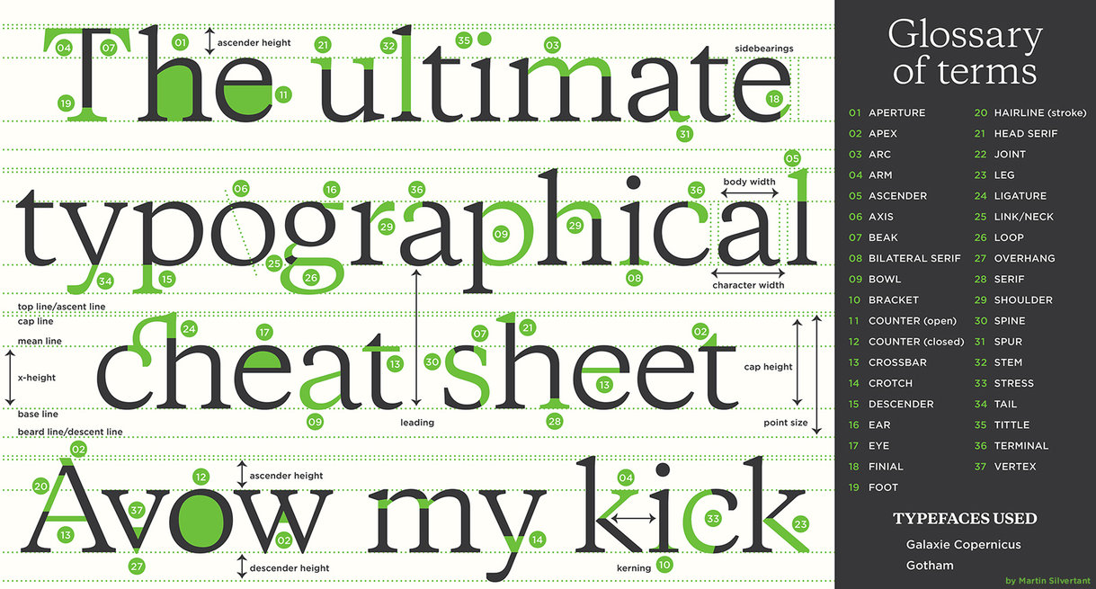
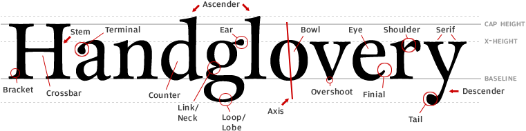
Next annotate 10 characters of your chosen typeface. You can choose from upper case, lower case or numerals. Each character must have at least 3 annotations. Look for consistencies (or variations) in the letterforms and try to understand the system the typographer has built into the shapes. Look for obvious decisions as well as the most subtle, they're all valid. You can annotate objective comments, such as "The capital O is almost a perfect circle" or subjective comments such as "this lowercase E feels more rigid because it's 'finial' is cut at a perfectly straight angle". Use the Indesign template provided.
Along with your 5 letter studies and 10 annotated letters you need to bring a typeface specimen poster with all letters, numbers and major punctuation upper and lower case of your typeface. The design and layout is up to you. Include the foundry and who designed or revived the typeface. Also include a description of the typeface, either from the foundry of of your own analysis. Focus on it's history, why it's relevant and why you like it. Think of this as a poster promoting the typeface.
🔥🔥 Download the Indesign Template 🔥🔥
Deliverables (all 11x17in)
5 letter studies
10 annotated letters
Typeface specimen poster
There are a few resources I would highly recommend to get you started. You should get Karen Cheng's Designing Type or take it out from the library. It's an amazing resource for anyone interested in the subject and a huge advantage for this project. Old typefaces are always a great place to start. You're better off looking at foundry websites, old specimen books, or sites like Fonts in Use than just clicking through your library. If you find something you like, email me. Chances are I might have a copy I could lend you, or you could consider reaching out to the foundry to see if they give free copies away to students for non-commercial projects. Some of the newer foundries allow you to download trial fonts. And (again) below are some recommended places to look for good, quality type. This assignment will mean a lot more to your understanding of typography if you find something that is well drawn and considered. That doesn't mean there aren't some nice Google Fonts or anything on Open Foundry, but you should probably steer clear of Dafont for this one.
Typography References
Classics
ITC
Monotype
Font Shop
Linotype
URW++
Newer Foundries & Independent Type Designers
Commercial Type
Klim Type Foundry (Kris Sowersby)
Optimo
Lineto
Our Type
Tobias Frere-Jones
Hoefler & Co.
Production Type
Letters From Sweden
Playtype
Bold Monday
A2 Type
Open Foundry (decent, free fonts)
NKOTB
Grilli Type
Swiss Typefaces
Colophon Foundry
Radim Pesko
Milieu Grotesque
Schick Toikka
Camelot Typefaces
Medium Extra Bold
Or Type