Assignment 01
Letter Crop
Week I
—Your assignment is to make 10 compositions of cropped letterforms. Your compositions must be 5×5" squares. They can be designed on the computer. The final versions must be mounted on ⅛" or ³⁄₁₆" white foam core, full bleed. No borders.
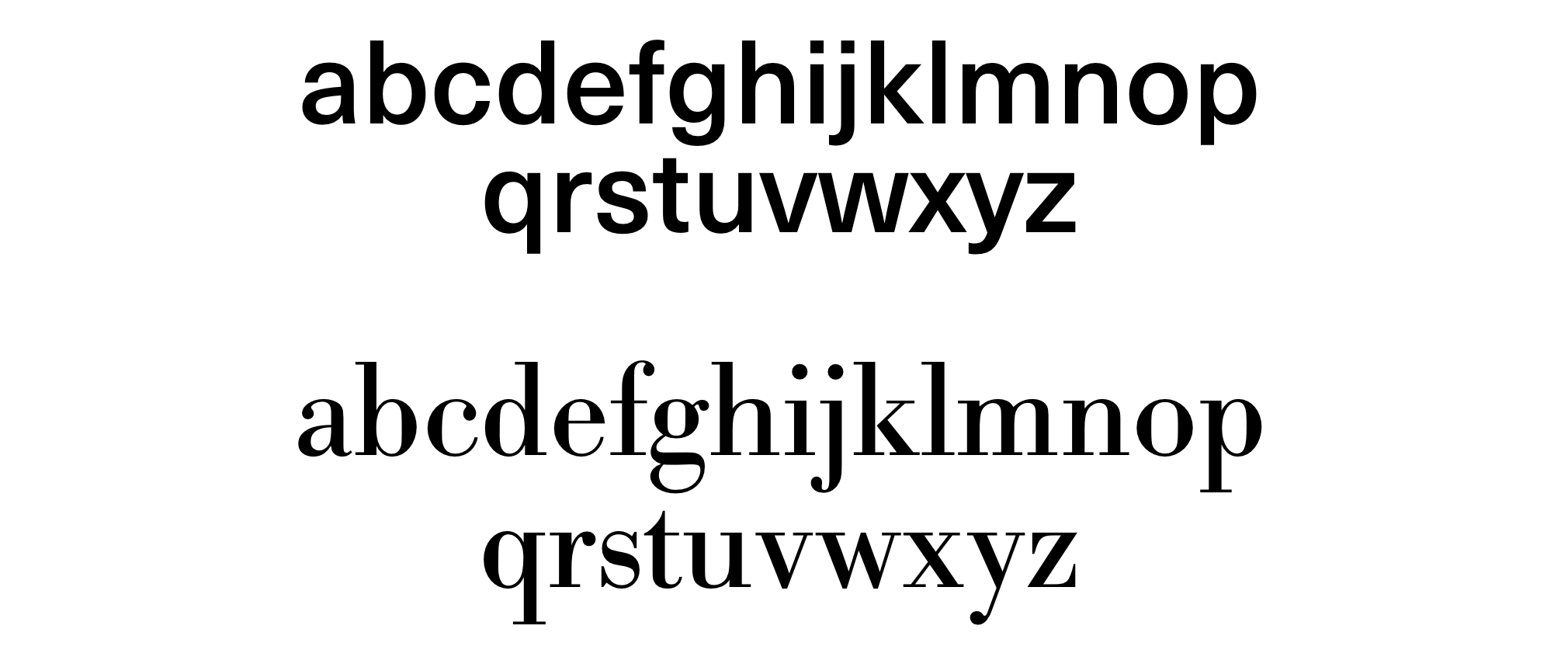
5 of these compositions should use the sans-serif typeface ‘Neue Haas Unica Medium’ (which you can download here). Choose one letter, and make your 5 compositions with the letter chosen. You can only select a lowercase letter (no capitals, punctuation or numerals). Your letterform should be 100% white. Your background should be 100% black. No color, no exceptions. No skewing or distorting the letter. Only one letterform in your composition.
The other 5 compositions should use the serif typeface ‘Bodoni Regular’ (which you can download here). Choose one letter, and make your 5 compositions with the letter chosen. You can only select a lowercase letter (no capitals, punctuation or numerals). Your letterform should be 100% black. Your background should be 100% white. No color, no exceptions. No skewing or distorting the letter. Only one letterform in your composition.
Recommended Materials
⅛" (one eighth inch) or ³⁄₁₆" (three sixteenth inch) thick foamcore, white
Double tack (double-sided sticky adheasive sheet)
X–acto knife or cutting tool with #11 blades
Cork–backed ruler
Self healing cutting mat
Bone Folder
Deliverables, 9.17.18
10 compositions, 5×5"
mounted on ⅛" or or ³⁄₁₆" foamcore
— 5 Sans-serif using ‘Neue Haas Unica Medium’
— 5 Serif using ‘Bodoni Regular’
Week II —We will review what you’ve made in class and discuss your work. Take what you’ve learned from the class critique and apply them to your second round. For round two, you only need to bring six letter crops total. Three with Unica, three with Bodoni. Consider your compositions as a triptych, they should work together as a set of three.
Deliverables, 9.24.18
6 compositions, 5×5"
mounted on ⅛" or or ³⁄₁₆" foamcore
— 3 Sans-serif using ‘Neue Haas Unica Medium’
— 3 Serif using ‘Bodoni Regular’
Background
In typography, a serif is a small line attached to the end of a stroke in a letter or symbol. A typeface with serifs is called a serif typeface (or serifed typeface). A typeface without serifs is called sans-serif or sans serif, from the French sans, meaning “without”. Some typography sources refer to sans-serif typefaces as “Grotesque” (in German “grotesk”) or “Gothic”, and serif typefaces as “Roman”.
Univers designed by Adrian Frutiger (1957)
Univers was one of the first typeface families to fulfil the idea that a typeface should form a family of consistent, related designs. Past sans-serif designs such as Gill Sans had much greater differences between weights, while loose families such as American Type Founders' Franklin Gothic family often were advertised under different names for each style, to emphasise that they were not completely matching. By creating a matched range of styles and weights, Univers allowed documents to be created in one consistent typeface for all text, making it easier to artistically set documents in sans-serif type. This matched the desire among practitioners of the “Swiss style” of typography for neutral sans-serif typefaces avoiding artistic excesses. Learn More.
Bodoni designed by Giambattista Bodoni (1740–1813)
Bodoni is the name given to the serif typefaces first designed by Giambattista Bodoni (1740–1813) in the late eighteenth century and frequently revived since. Bodoni's typefaces are classified as Didone or modern. Bodoni followed the ideas of John Baskerville, as found in the printing type Baskerville—increased stroke contrast reflecting developing printing technology and a more vertical axis—but he took them to a more extreme conclusion. Bodoni had a long career and his designs changed and varied, ending with a typeface of a slightly condensed underlying structure with flat, unbracketed serifs, extreme contrast between thick and thin strokes, and an overall geometric construction.
When first released, Bodoni and other didone fonts were called classical designs because of their rational structure. However, these fonts were not updated versions of Roman or Renaissance letter styles, but new designs. They came to be called ‘modern’ serif fonts and then, until the mid-20th century, they were known as Didone designs. Bodoni's later designs are rightfully called “modern”, but the earlier designs are now called “transitional”. Learn More.