Assignment 02
Typography
Massimo Vignelli is infamous for using a specific set of typefaces throughout his work. He has his favorites, but for this assignment you must choose one of the following...
1. Garamond
2. Bodoni
3. Futura
4. Times New Roman
5. Helvetica
6. Univers
Next week show 100 unique typographic experiments investigating this typeface. Consider your letter crop assignment as the first stage of your investigation. Consider the fundameltals of composition we discussed during our critique. Also consider letter choice. All characters are up for grabs: number, letter, or punctuation mark.
Your experiments should be 8×10". These experiments can consist of found footage, self made imagery, and existing typography. Whatever the outcome, your experiment should formally connect with the letterforms of your typeface. Each composition can only use a single letterform, similar to your letter crops. One character only, without repetition or duplication. Analyze every curve and edge to your typeface. Find what's interesting and enhance it. Your only restriction is that your compositions must be 100% black & white, meaning remove any grey values. A quick and easy way to do this to images in posterization in photoshop.
As a final result, you are tasked with bringing this collection into a publication featuring at least 25 of your type compositions. Along with your experiments, you must typeset the essay “The Crystal Goblet” by Beatrice Warde. The essay must be set in your chosen typeface.
We will revisit this assignment in week 13, when we design a type specimen section for your publication. You will design the section showcasing the following...
— Character Set, upper and lowercase with punctuation and numerals
— Example text setting, from 10pt to 100pt in 10pt increments
— 10 page history section describing the story of your typeface.
Deliverables
100 black & white compositions, 8×10"
Collection booklet
— At least 25 experiments
— Essay typeset
Round 01 Experiment
10.01.18
Bring in your 100 black & white compositions printed at 8×10". We will discuss in the round, do not hang your work for todays crit.
Round 02 Edit
10.8.18
Refine and edit your experiments. What was working last week? Begin to explore that further. Make changes to old experiments, develop new experiments.
Decide on a size for your publication. Pace out your initial experiments in a considered order. Design a front and back cover. Typeset the essay “The Crystal Goblet” and your specimen section.
Round 03 Final
10.15.18
Design your publication to the following sizes, choose one of the three:
— 6×9"
— 8.5×11"
— 7.5×7.5"
Print your publication ✳to scale✳ black and white using InDesign’s “print booklet” feature. This will allow us to flip through your pages in order. Saddle stitch (staple) your edition in the center so they're bound.
Refine your essay’s text setting and consider your experiments pacing. What you show is the final outcome of this phase of the assignment.
We will revisit this assignment in week 13, where you will combine your work completed with a type specimen. This edition will be printed through Lulu.
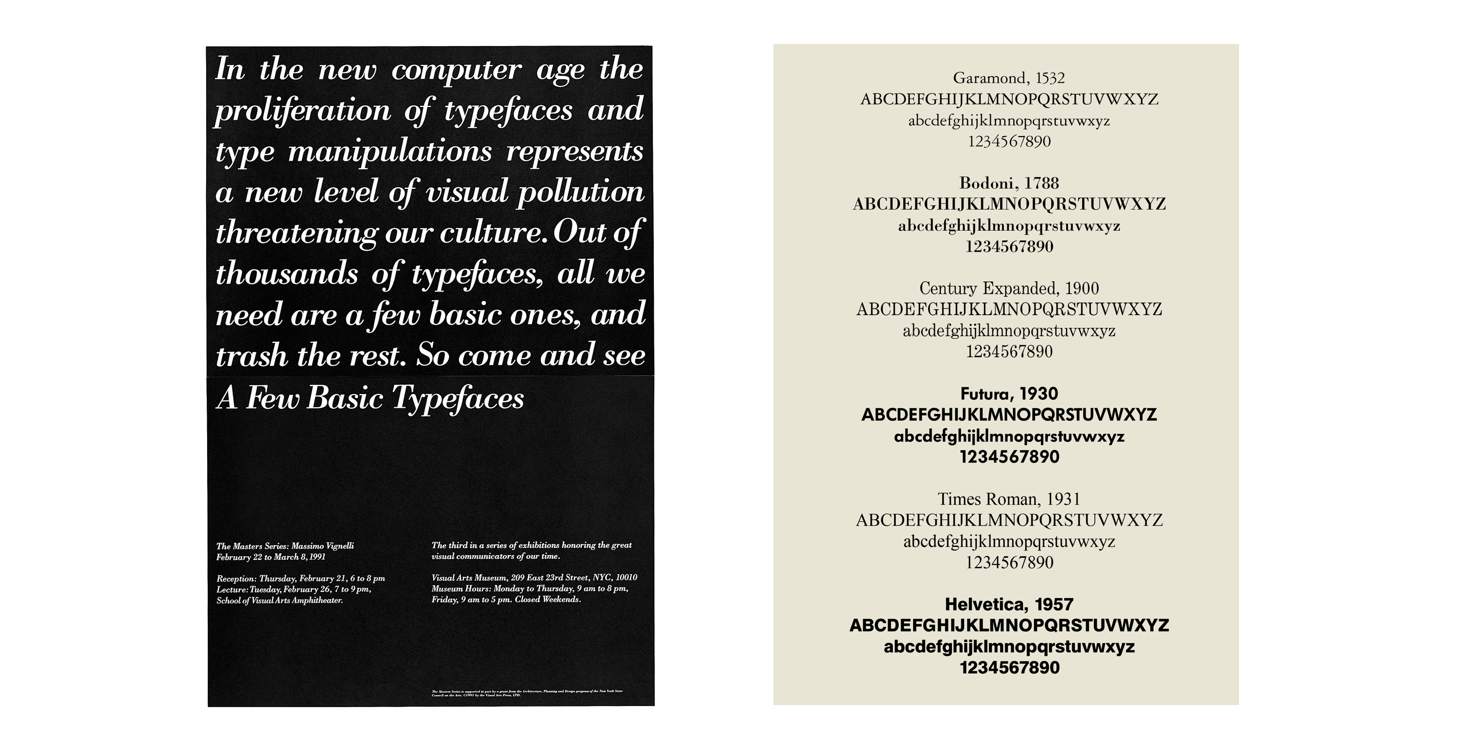
Massimo Vignelli’s A Few Basic Typefaces
from Fonts in use
This Massimo Vignelli poster announces the School of Visual Arts’ “third in a series of exhibitions honoring the great visual communicators of our time.” February 22 to March 8, 1991 at the Visual Arts Museum. According to Vignelli:
The exhibition showed work that we had done over many years by using only four typefaces: Garamond, Bodoni, Century Expanded, and Helvetica. The aim of the exhibition was to show that a large variety of printed matter could be done with an economy of type with great results. In other words, is not the type but what you do with it that counts.
Vignelli is famous (or infamous) among designers for sticking to a handful of typefaces and publicly poo-pooing all the new stuff that was sprouting in the early years of DTP. He expounds on his philosophy in Canon:
As I said, at the time, if all people doing desktop publishing were doctors we would all be dead! Typefaces experienced an incredible explosion. The computer allowed anybody to design new typefaces and that became one of the biggest visual pollution of all times. …
I still believe that most typefaces are designed for commercial reasons, just to make money or for identity purposes. In reality the number of good typefaces is rather limited and most of the new ones are elaborations on pre-existing faces. Personally, I can get along well with a half a dozen, to which I can add another half a dozen, but probably no more. Besides those already mentioned, I can add Optima, Futura, Univers (the most advanced design of the century since it comes in 59 variations of the same face), Caslon, Baskerville, and a few other modern cuts. As you can see my list is pretty basic but the great advantage is that it can assure better results. It is also true that in recent years the work of some talented type designers has produced some remarkable results to offset the lack of purpose and quality of most of the other typefaces.
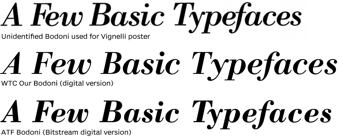
The exhibition poster, however, doesn’t use WTC Our Bodoni, opting instead for a more standard digital or phototype version of Bodoni, perhaps to reflect the work shown in the exhibition using older cuts of the typeface.